
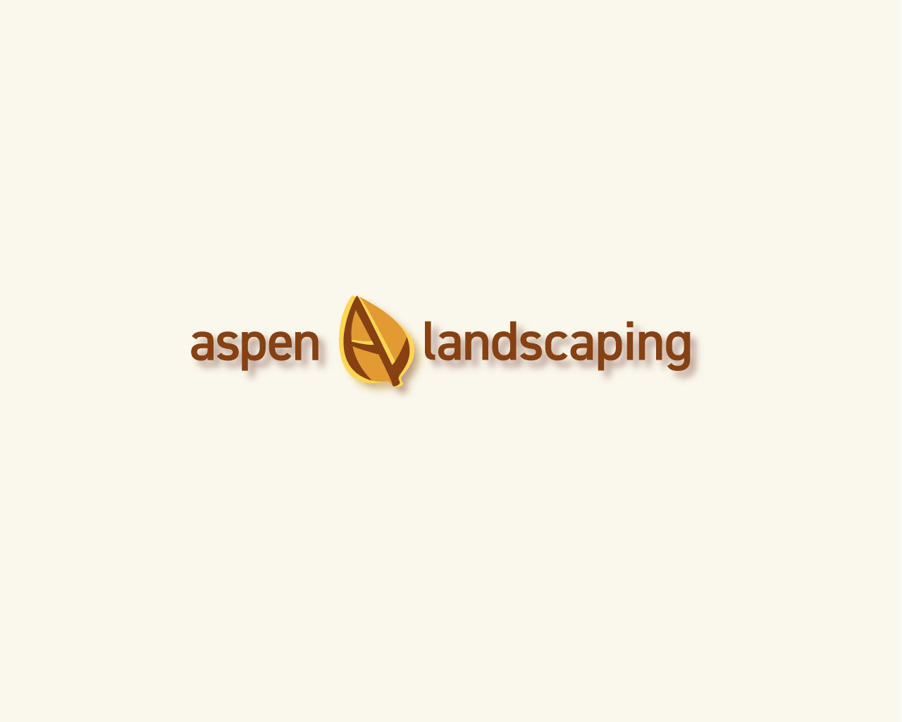
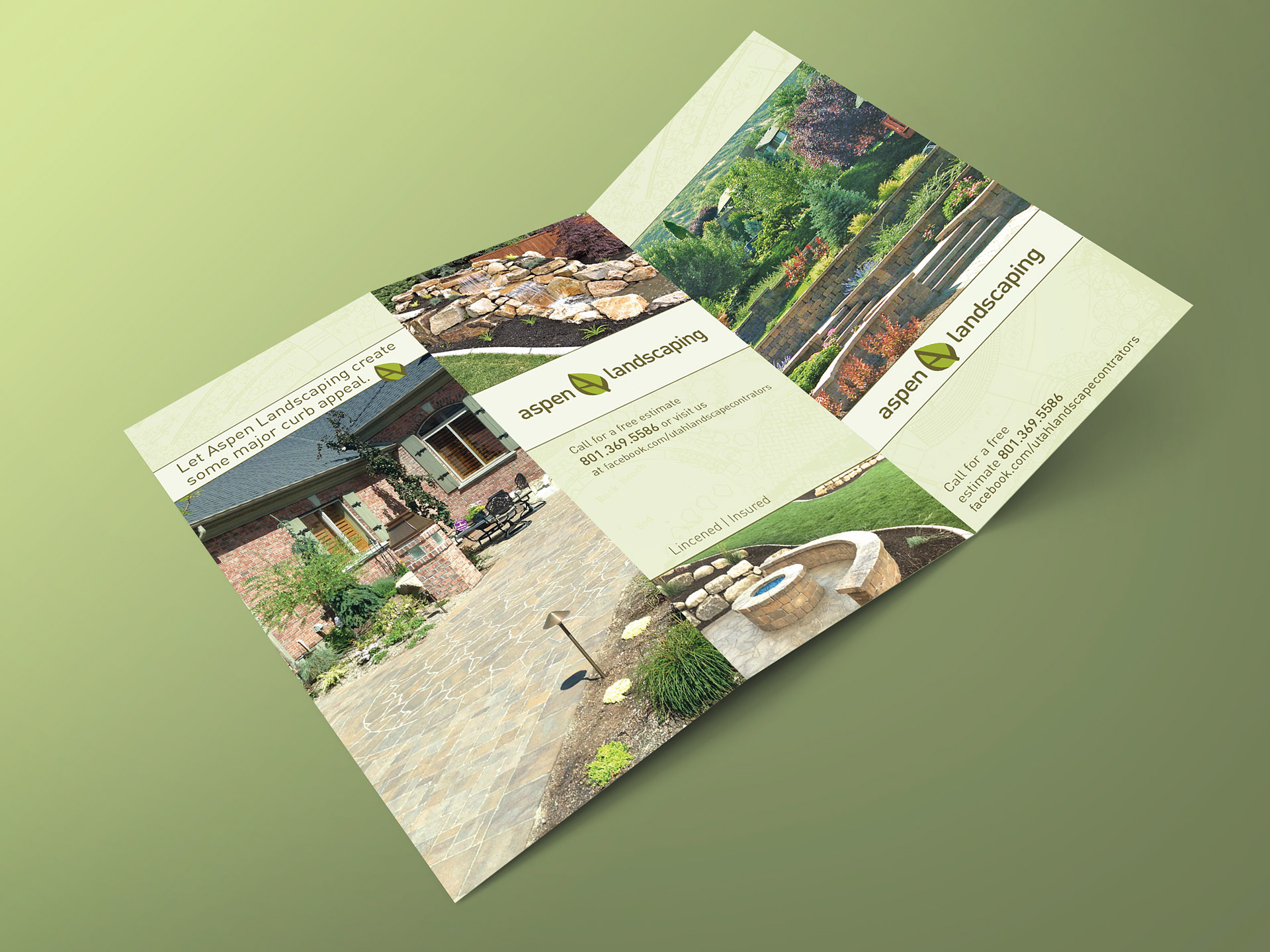
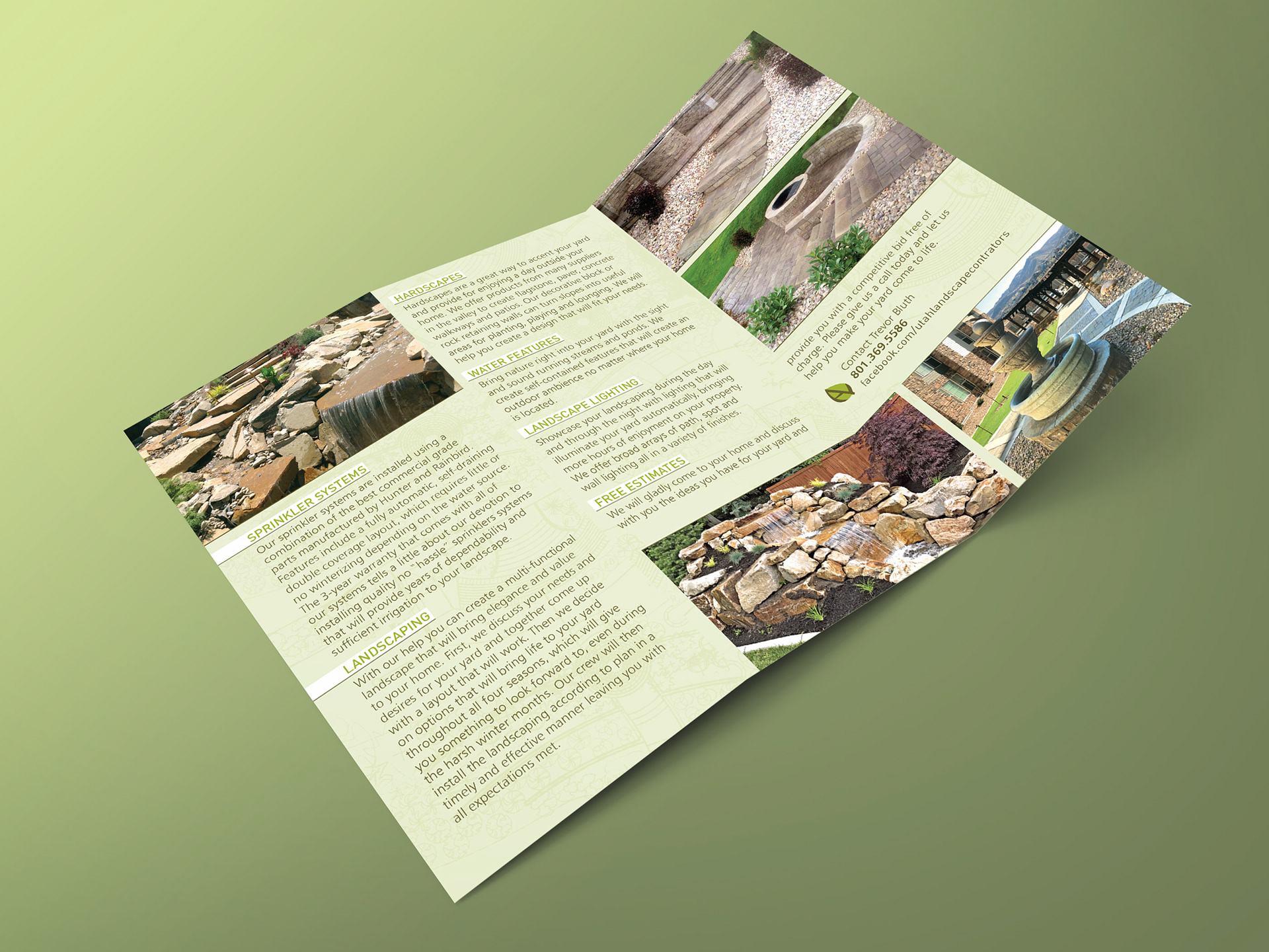
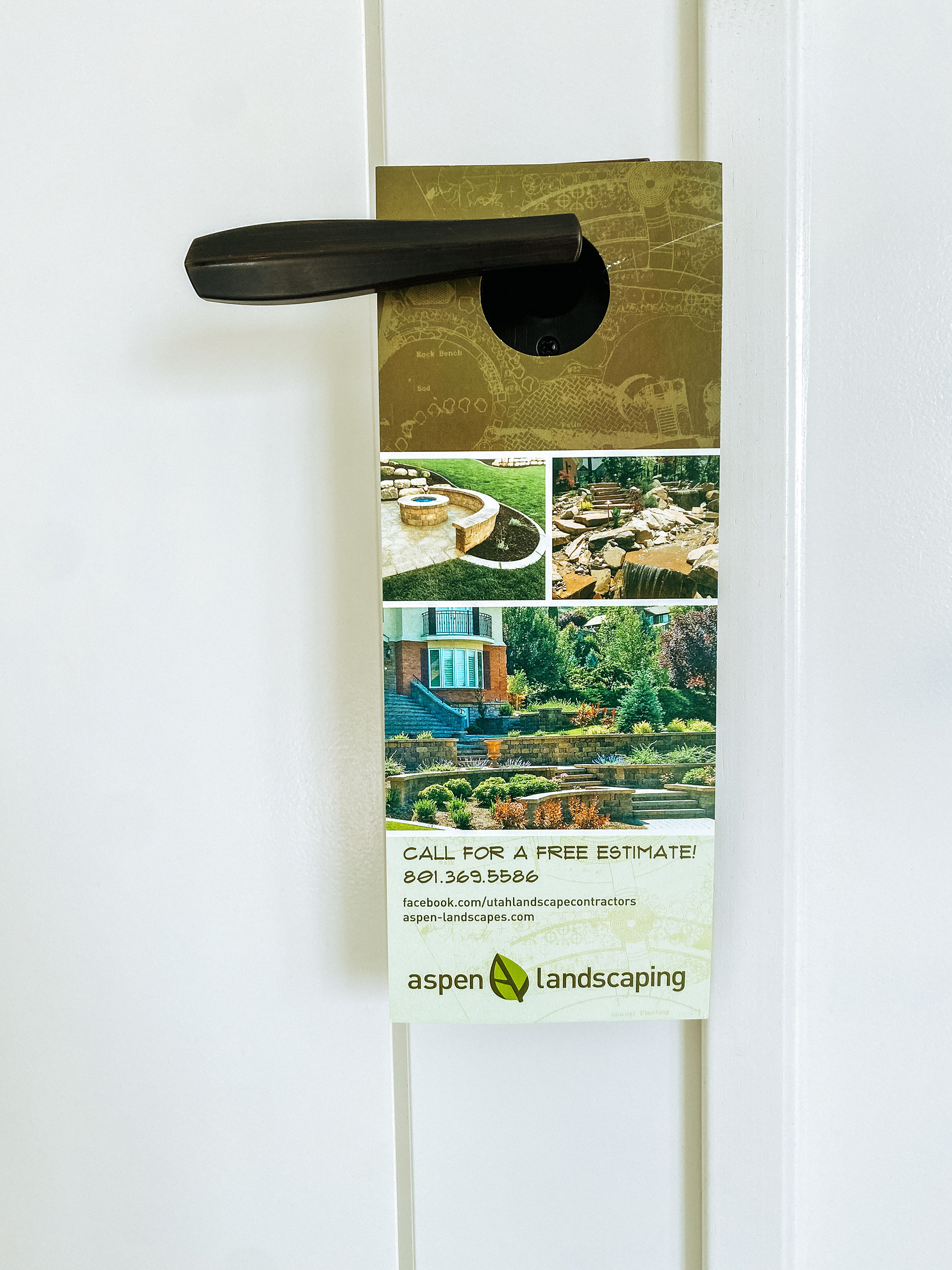
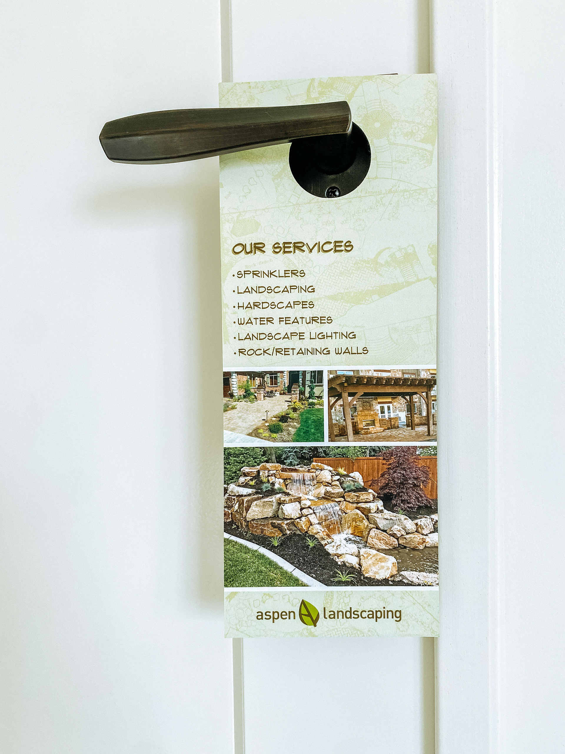
I collaborated with the owner of Aspen Landscaping to develop a logo that captured the essence of their trade. The client requested a clean and simple design, so I explored several directions before finalizing the aspen leaf as the key visual. The leaf was refined to showcase its natural veins, which also formed a subtle “A” for Aspen and “L” for Landscaping. To emphasize seasonality, I built a color palette that included both fresh greens and an alternate combination inspired by leaves changing throughout the year. From this foundation, I expanded the brand strategy to include earthy tones, landscape plan textures, and modern lines, striking a balance between natural elements and a contemporary aesthetic.
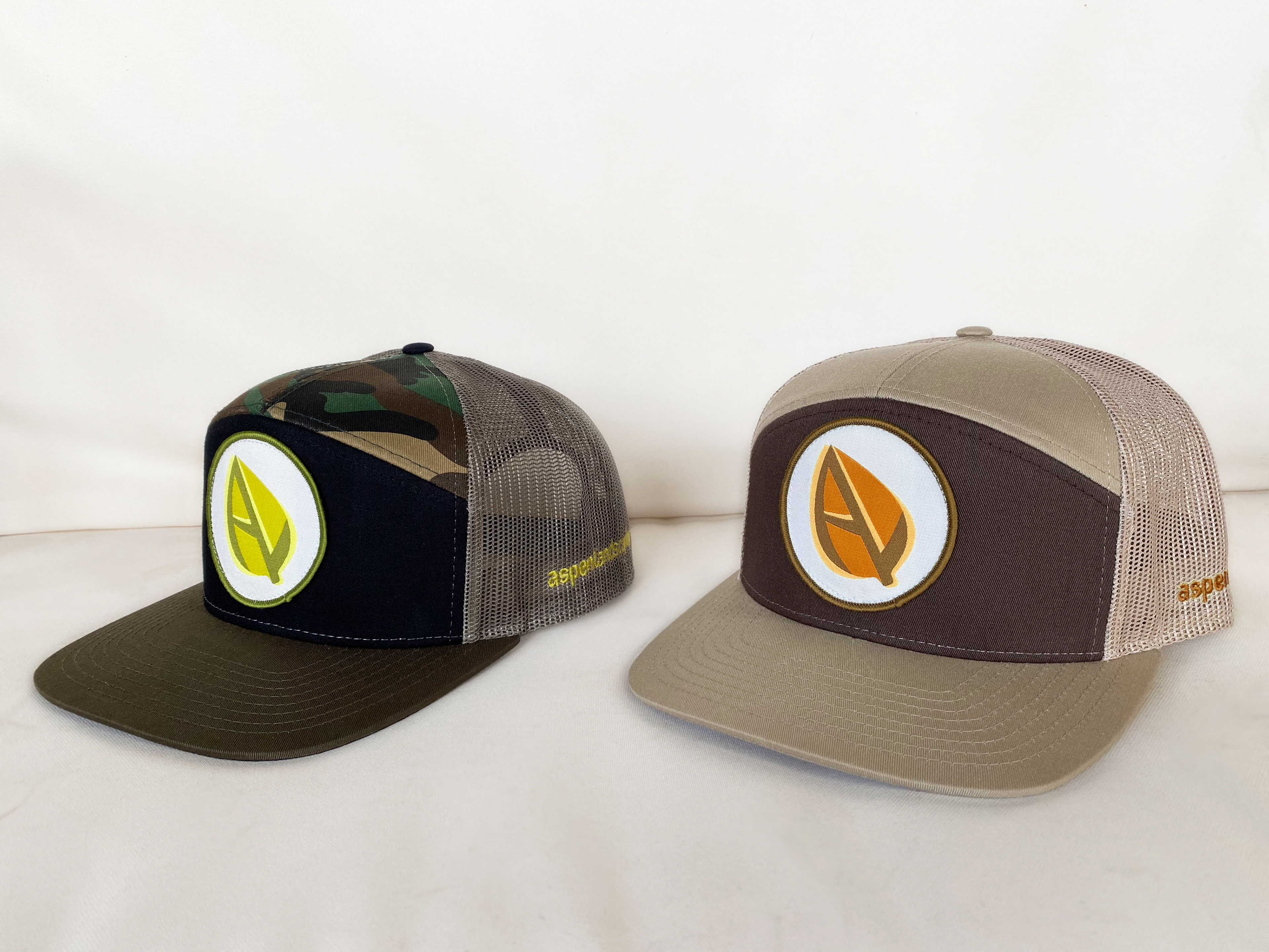
Company hats in two different styles to represent the different seasons.
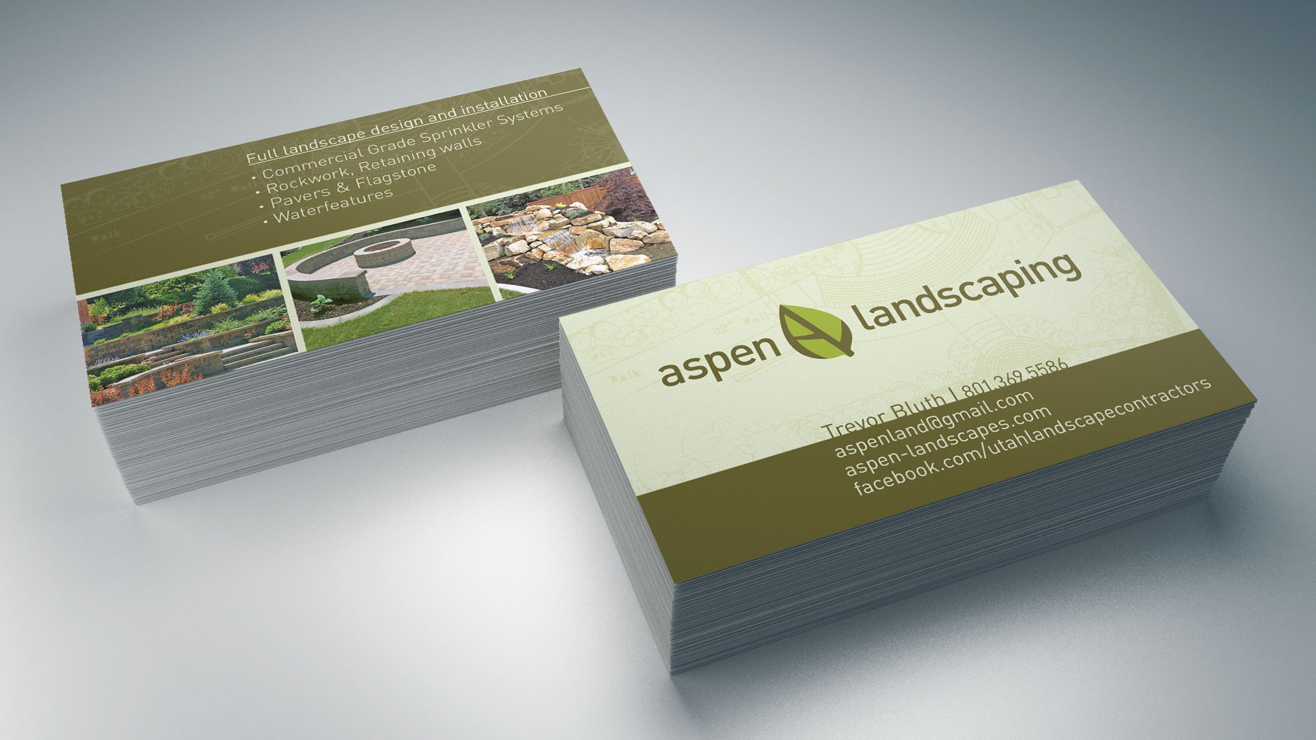
Company business cards.
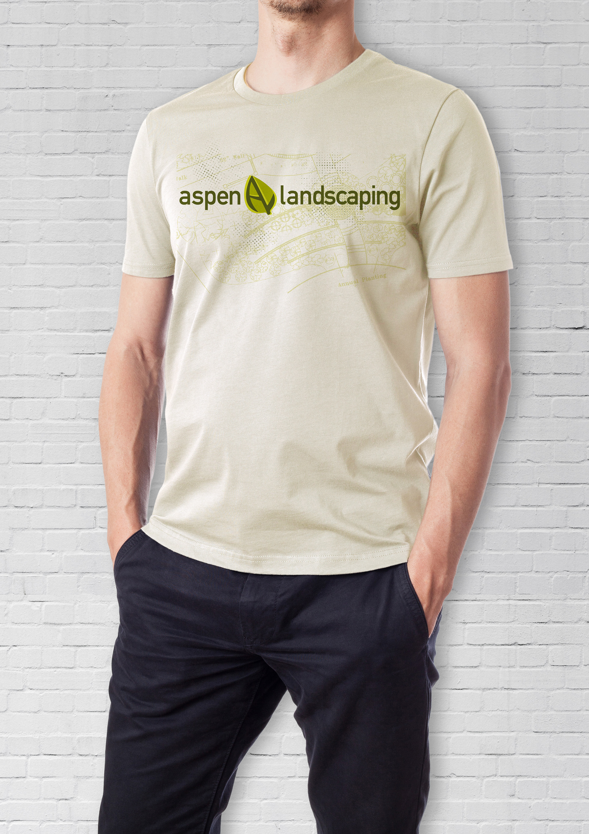
T-Shirt design
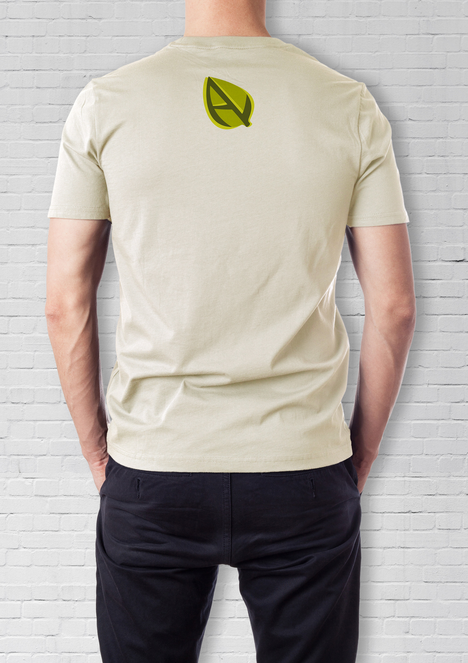
T-Shirt design
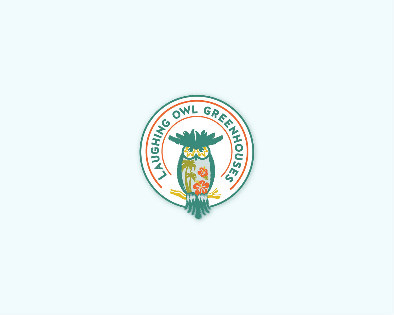
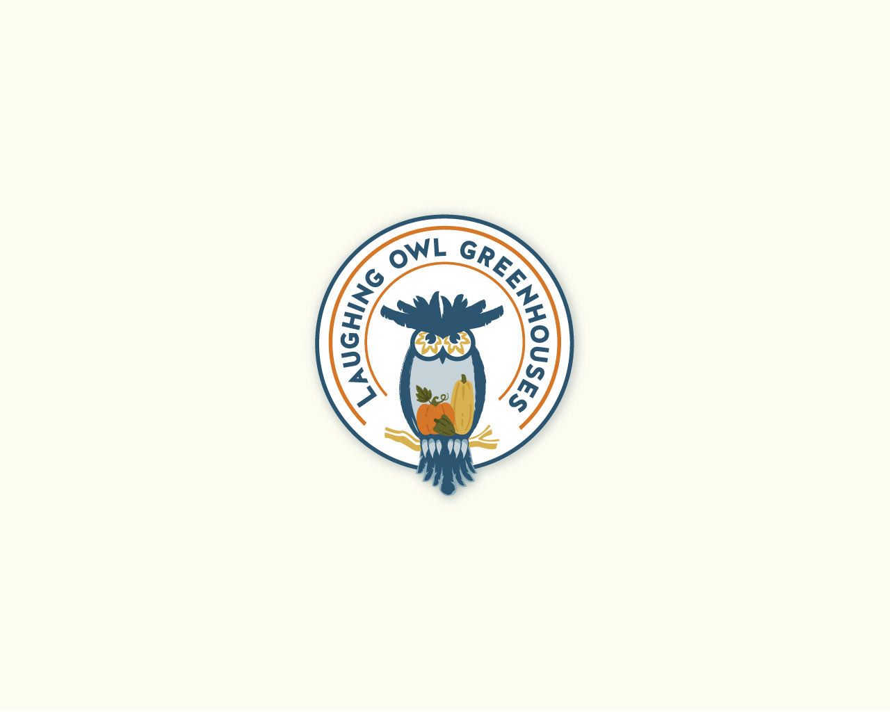
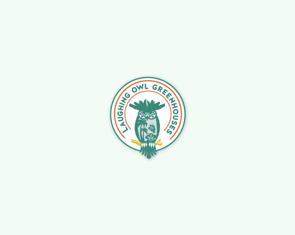
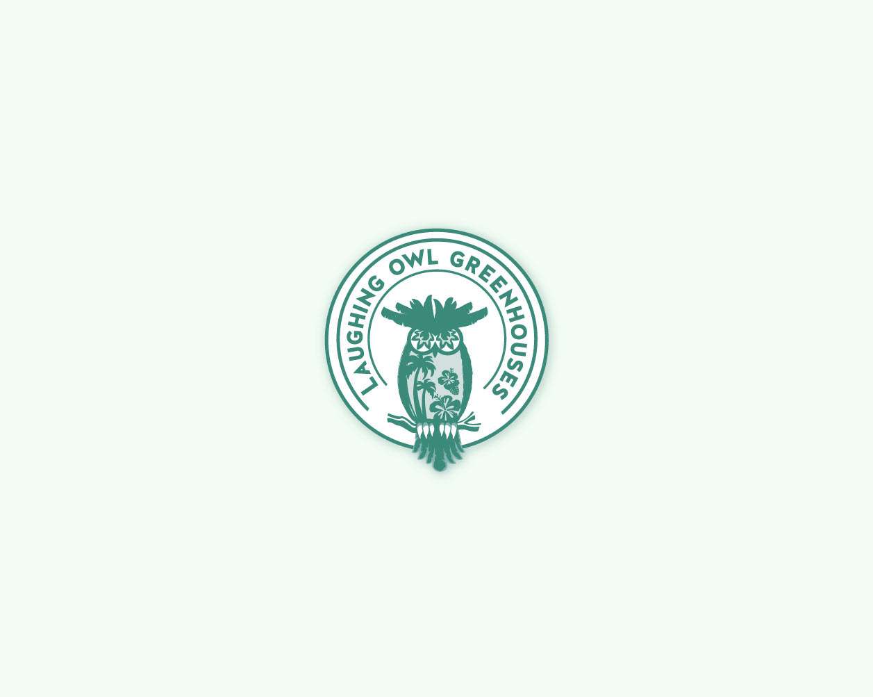
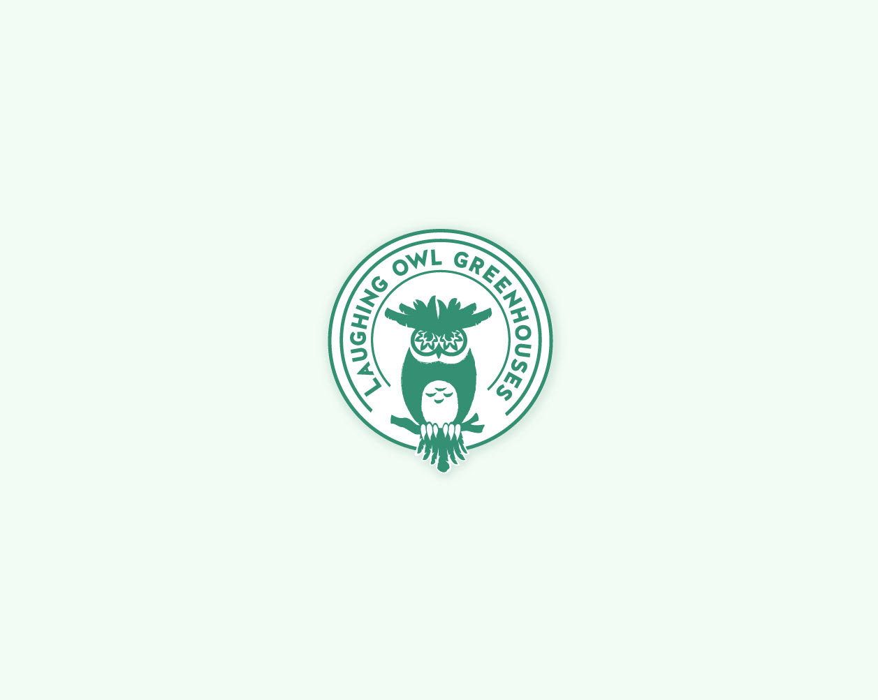
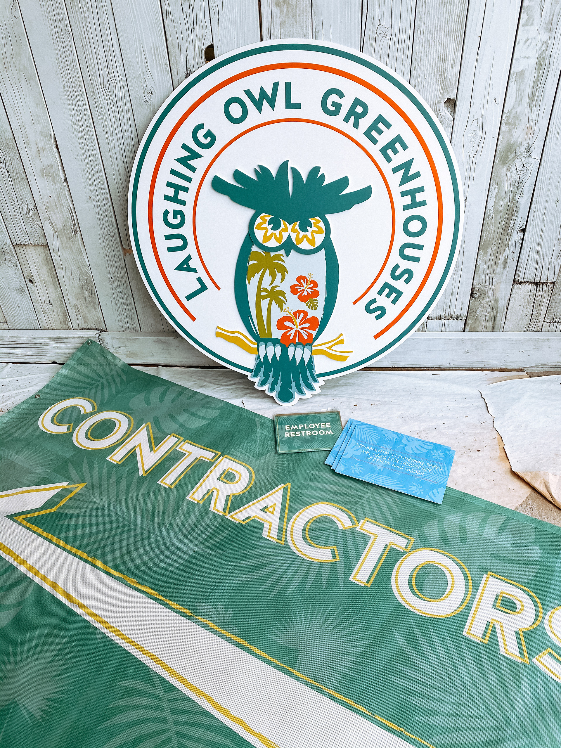
For Laughing Owl Greenhouses, I developed a brand strategy that captured the client’s vision of a playful, tropical identity filled with color. The client requested a logo featuring an owl with plant life incorporated into the design, as well as seasonal flexibility to reflect both summer and fall. I created several variations of the logo—including a full three-color version, a one-color version, and a simplified mark—for use across different applications.
To extend the brand, I designed signage throughout the greenhouse property to designate specific areas and created custom vinyl graphics for the main entrance doors. Additionally, the property had a large out-of-commission truck, so I transformed it into a roadside advertisement by designing a bold banner for the trailer box, turning it into a highly visible branding opportunity.
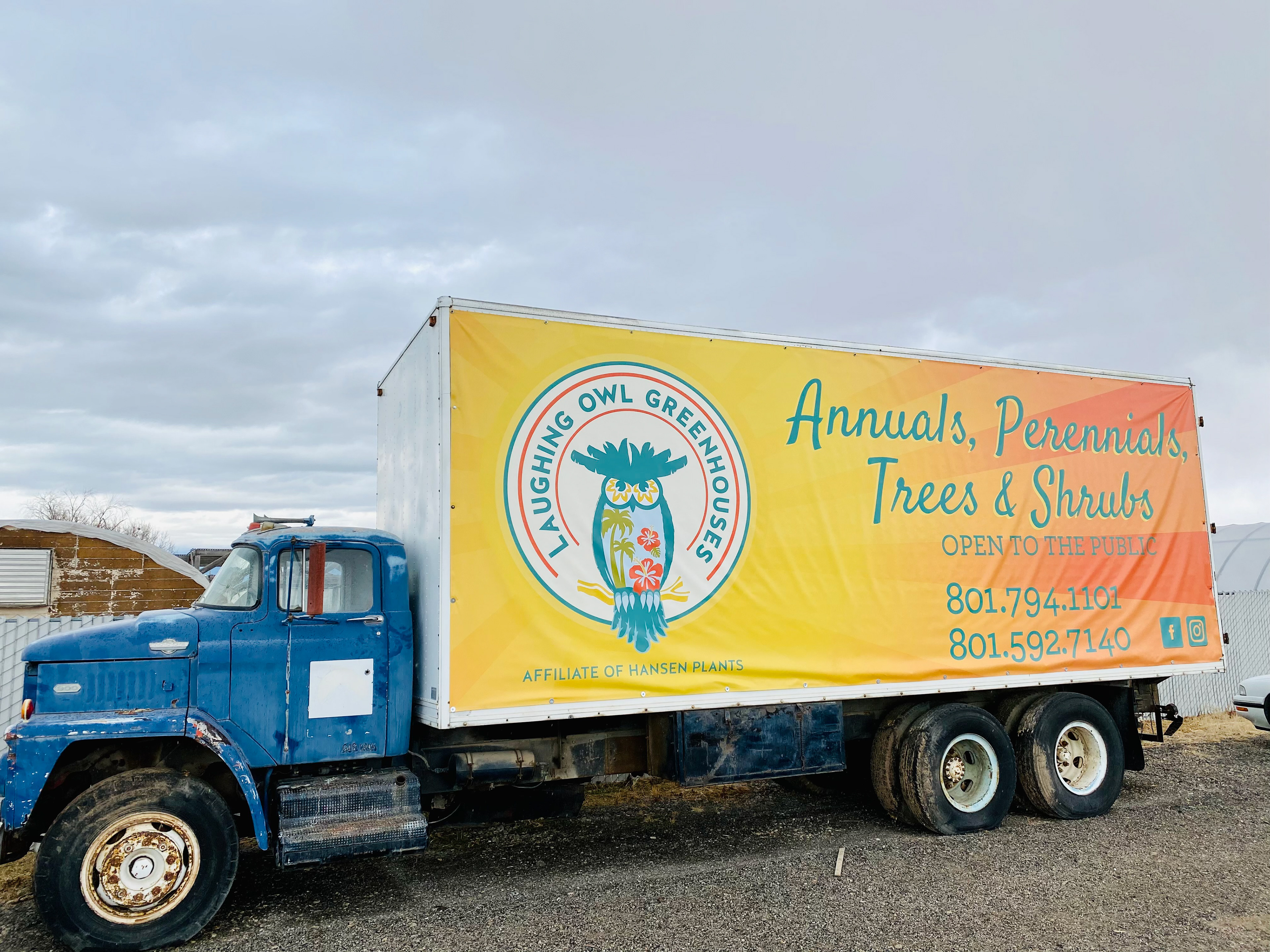
Vinyl banner advertisement for road side traffic announcing the greenhouses opening.
Various signage designs used to organize different areas of the greenhouse property. Large logo was placed inside the greenhouse main store area.
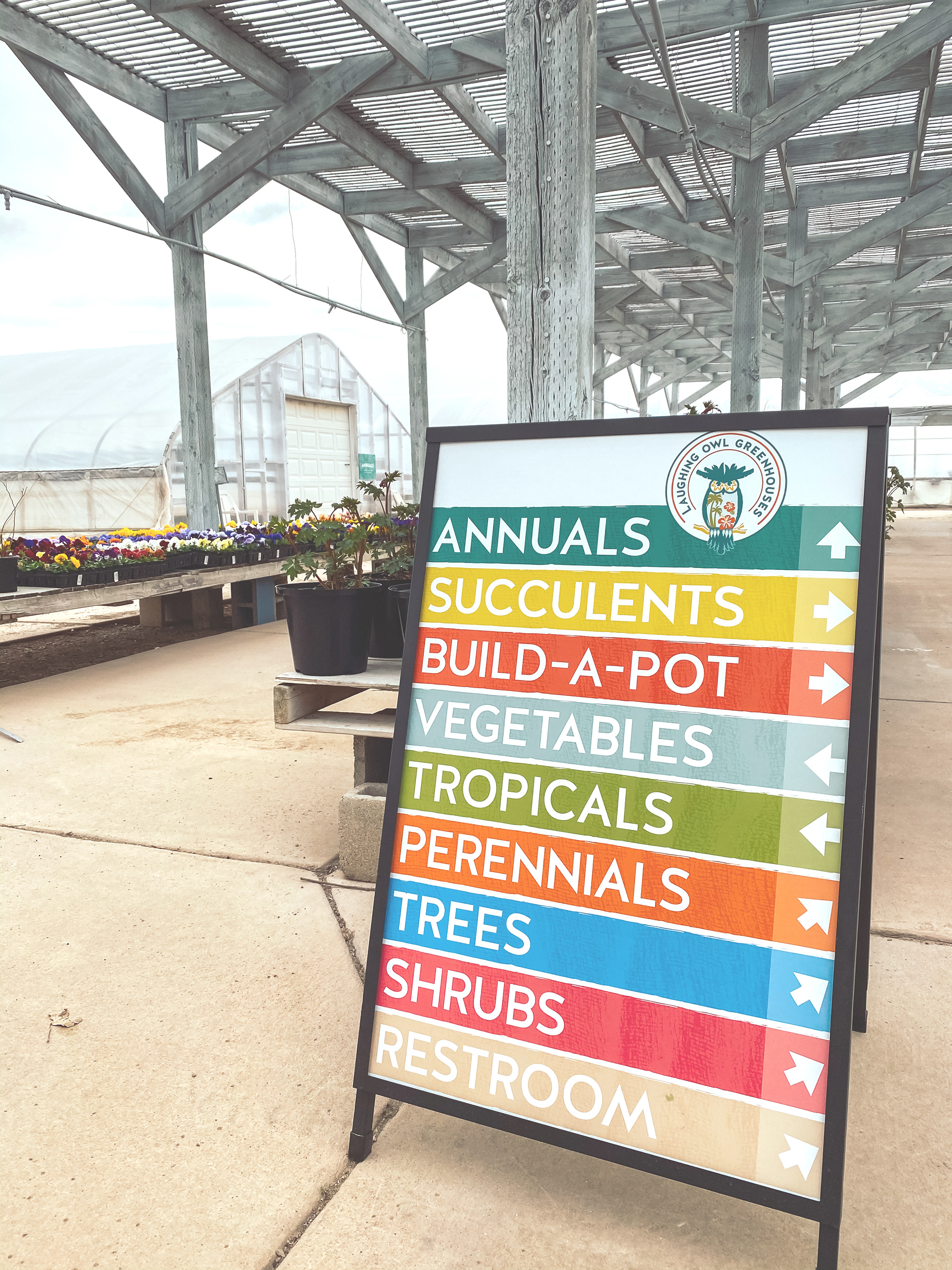
Wayfinding sign designed to help customers navigate all areas of the greenhouse property.
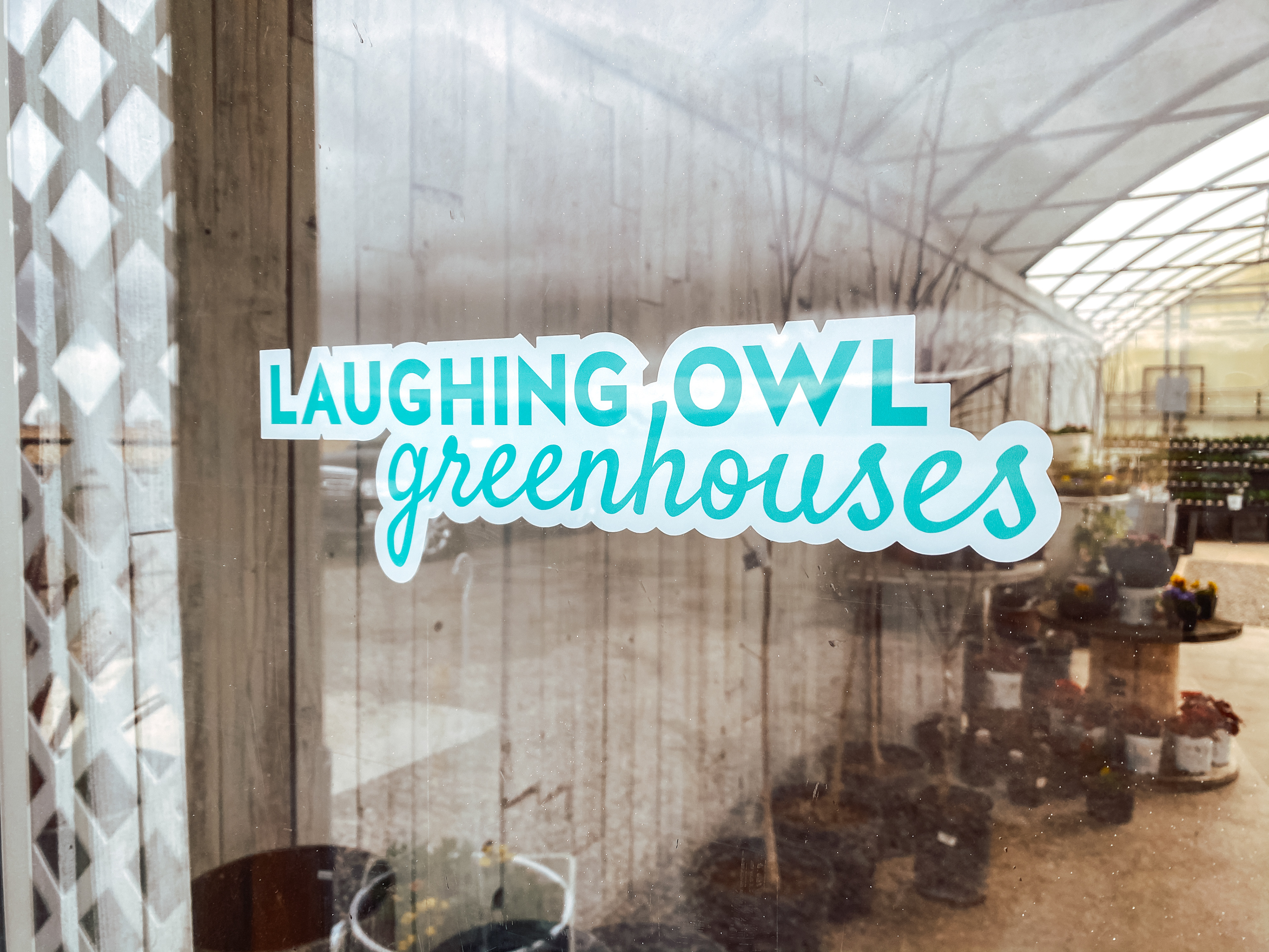
The front doors were decorated with a simplfied version of the logo.
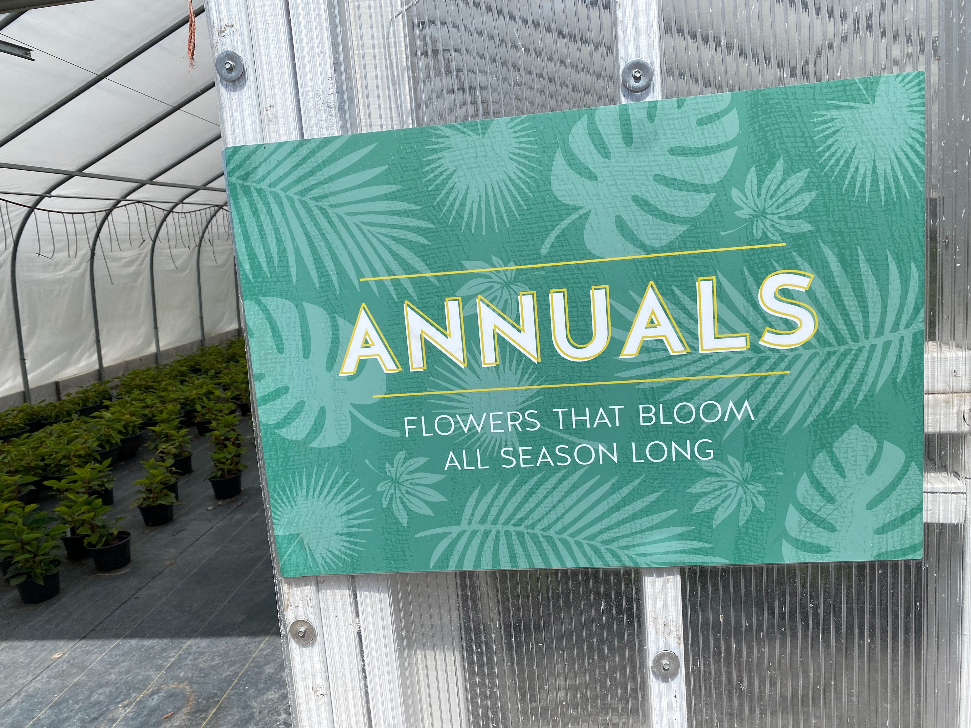
Signage used to designate each plants growing season.
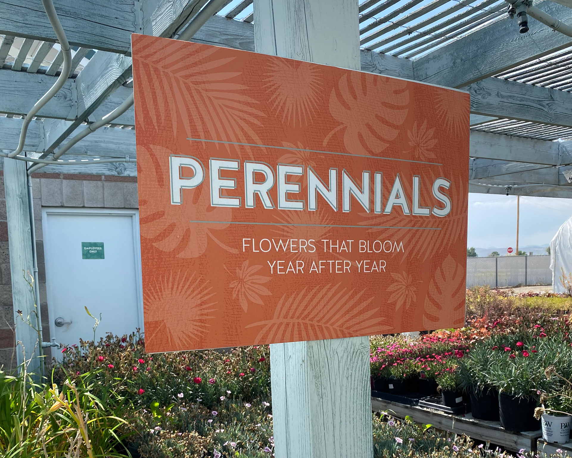
Signage used to designate each plants growing season.
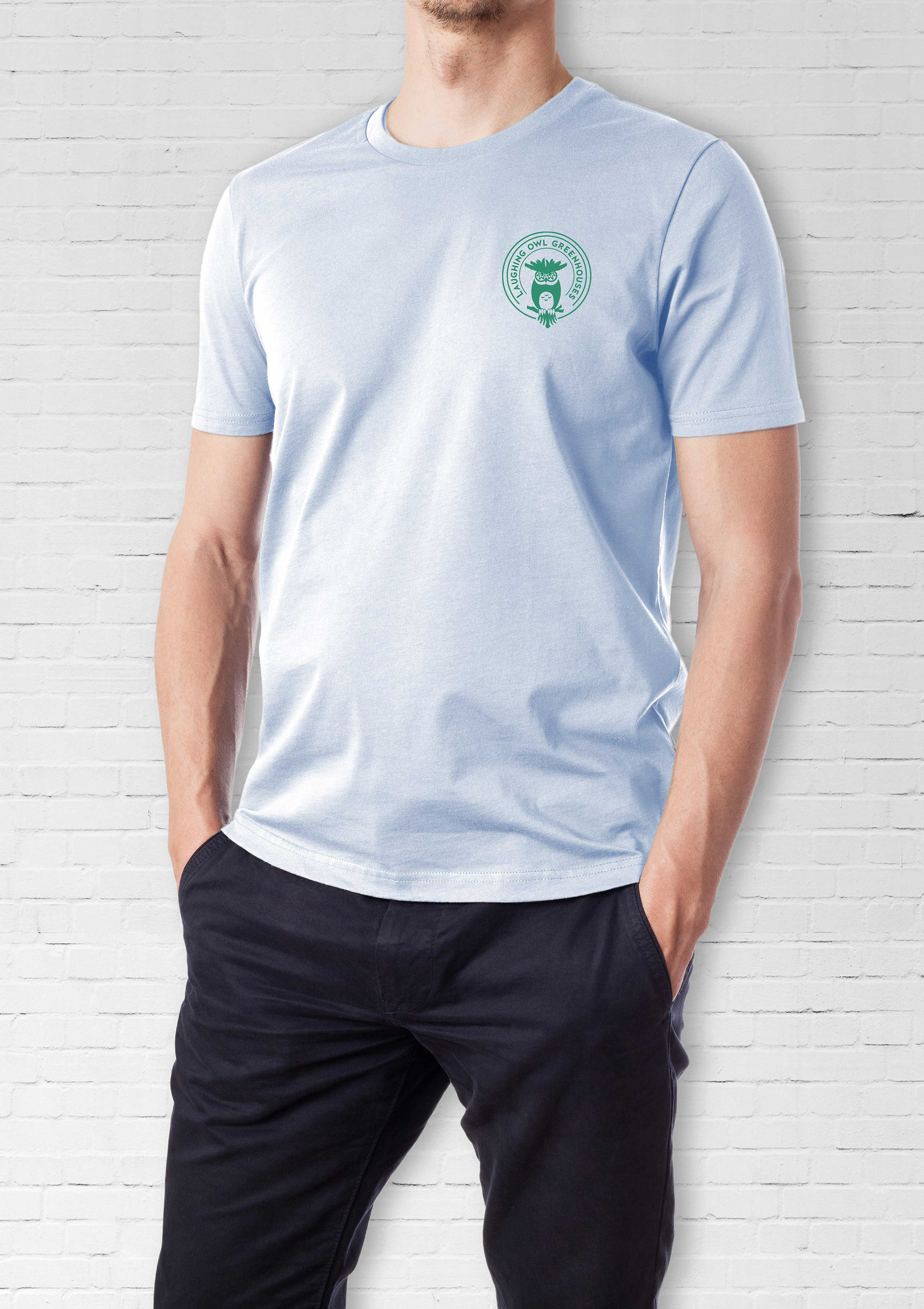
Employee t-shirt design front.
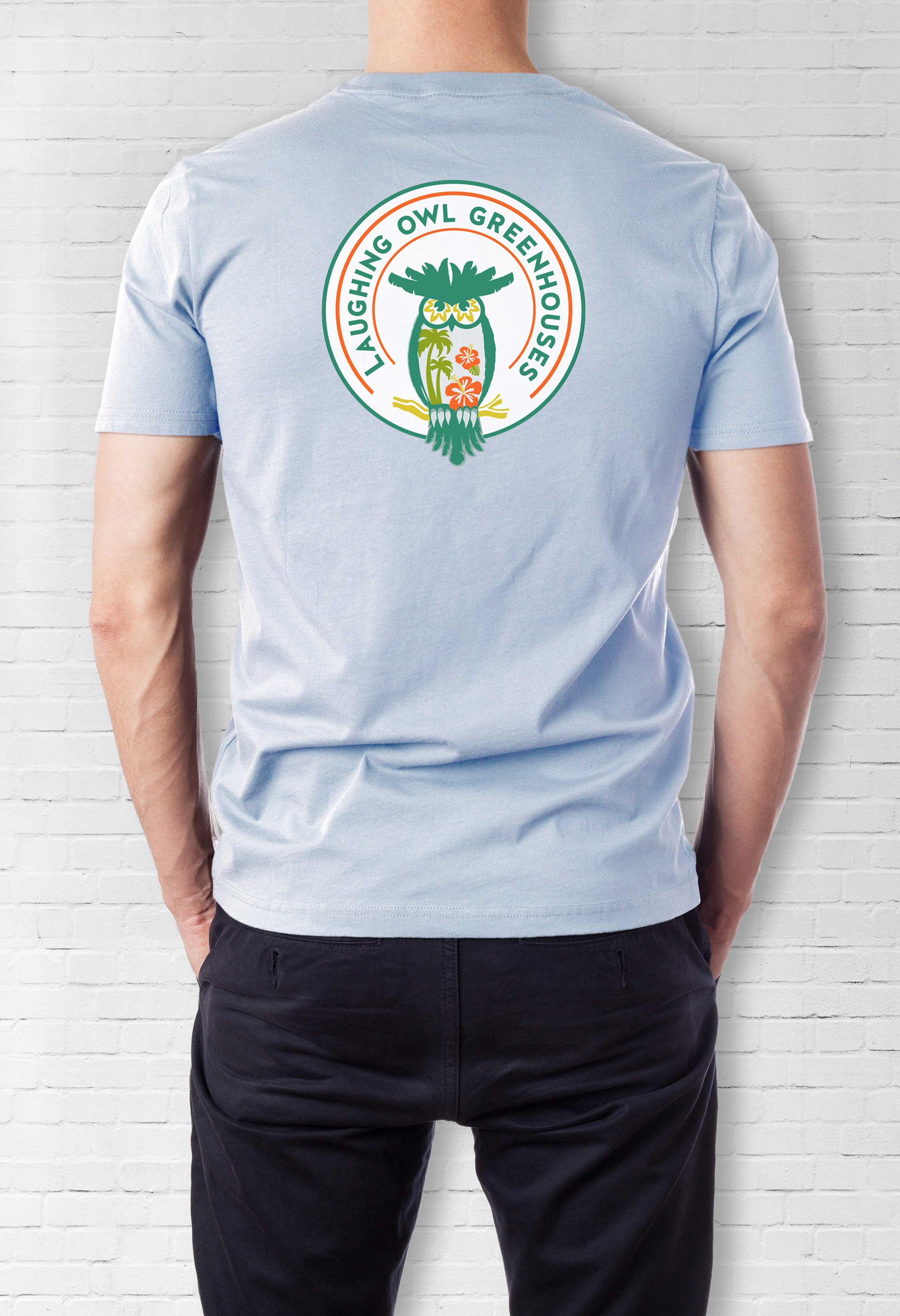
Employee t-shirt design back.
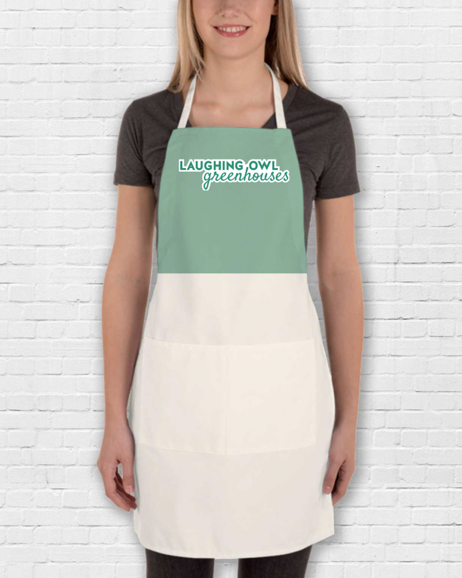
Employee apron design.
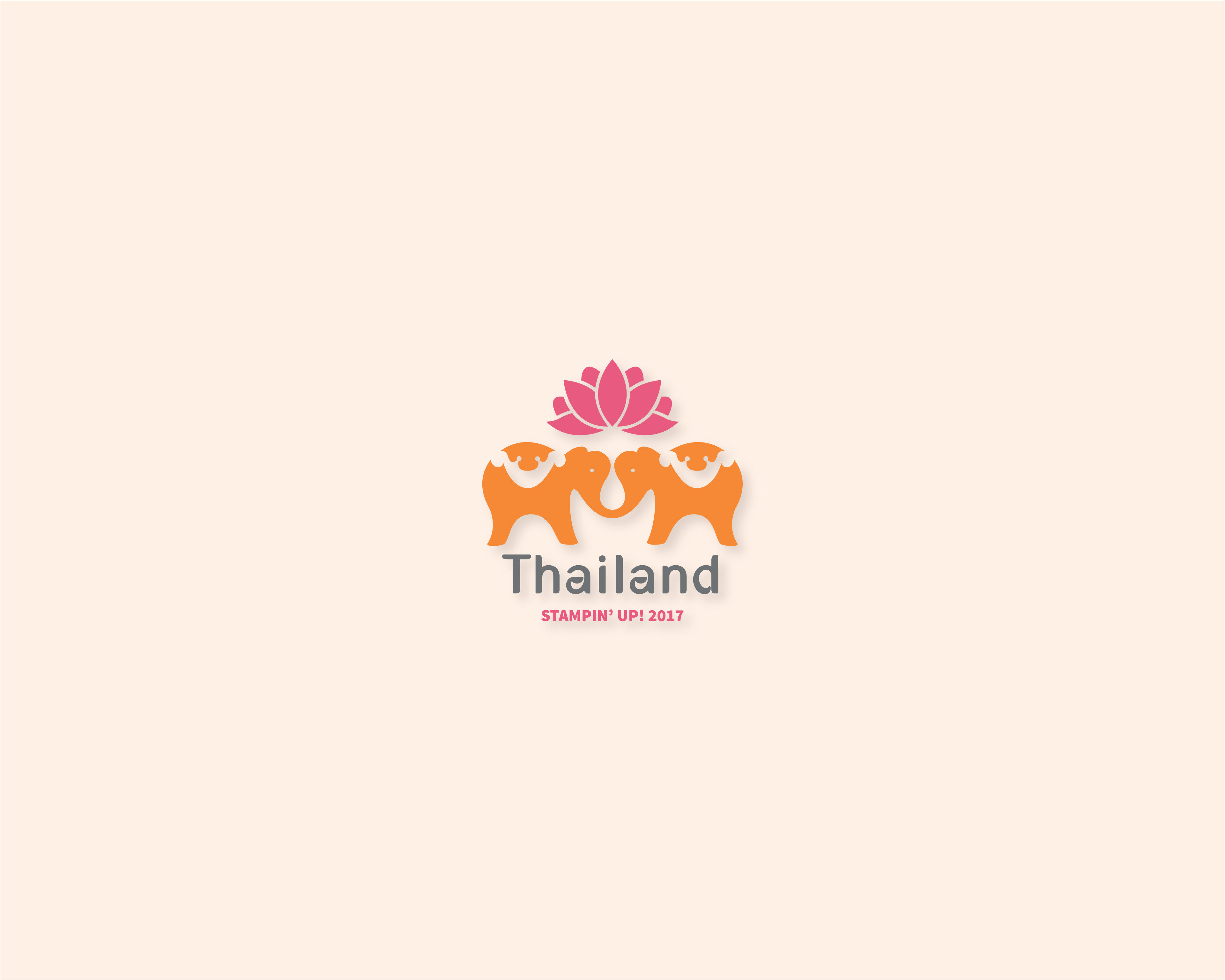
Logo created for emloyee incentive trip of a paper crafting company.
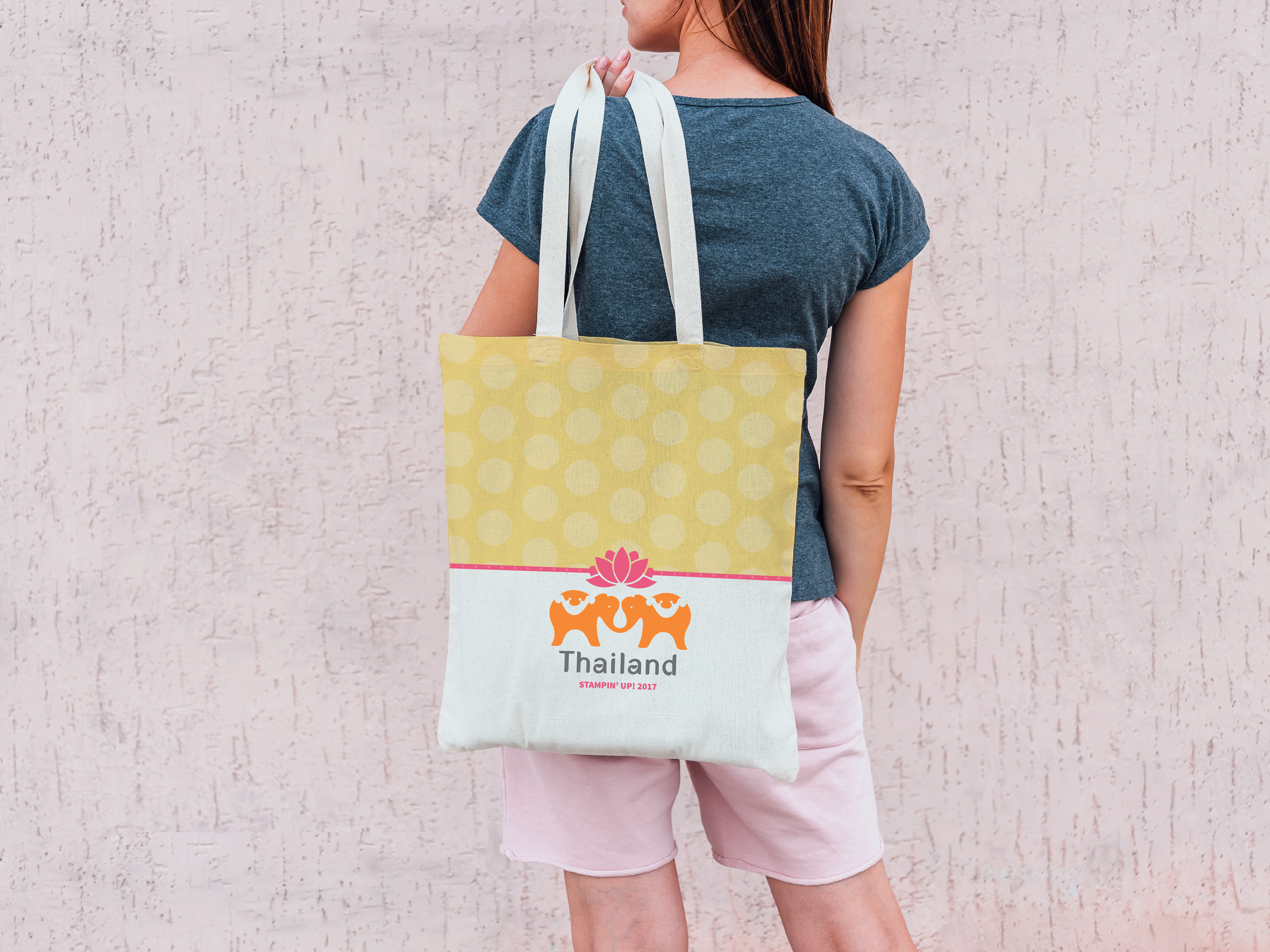
Stamp'in Up, a paper crafting company, asked me to design a logo for their Thailand employee incentive trip. I drew inspiration from Thai culture, symbolism, and vibrant colors to guide the design process. The final mark combined an elephant and lotus flower—two iconic symbols of Thailand—brought to life with bright, bold colors that reflect the country’s energy and spirit. The result was a logo that celebrated the destination while staying true to Stamp'in Up's creative brand.
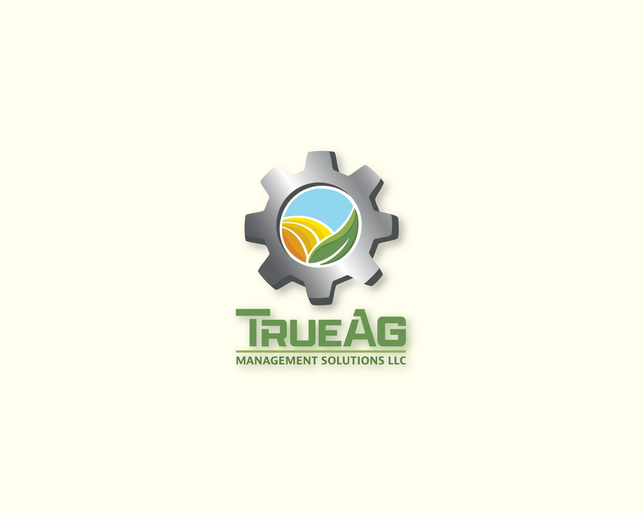
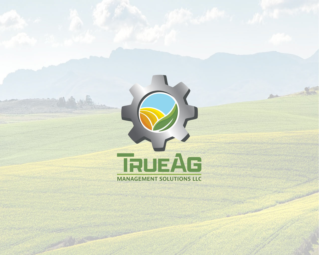
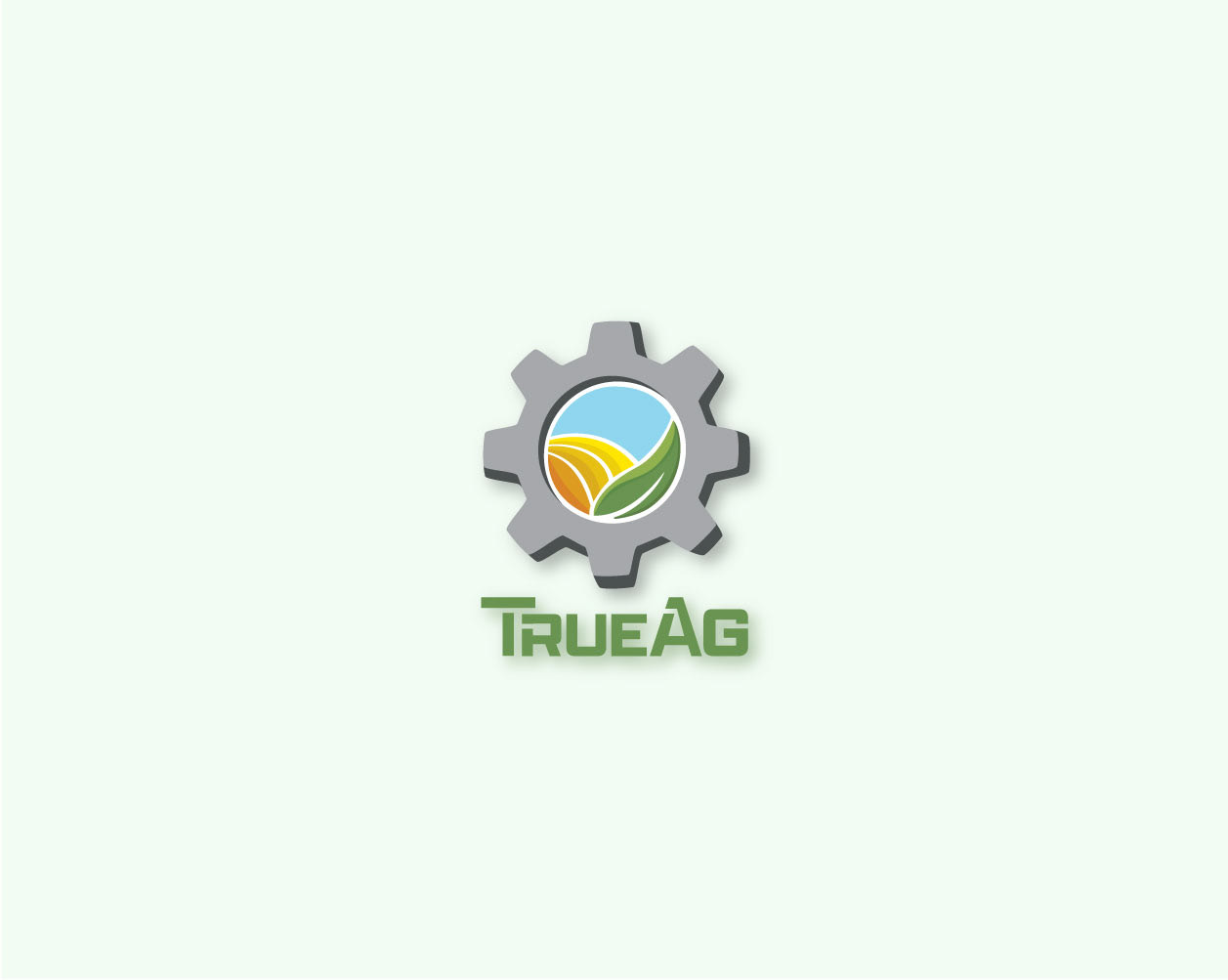
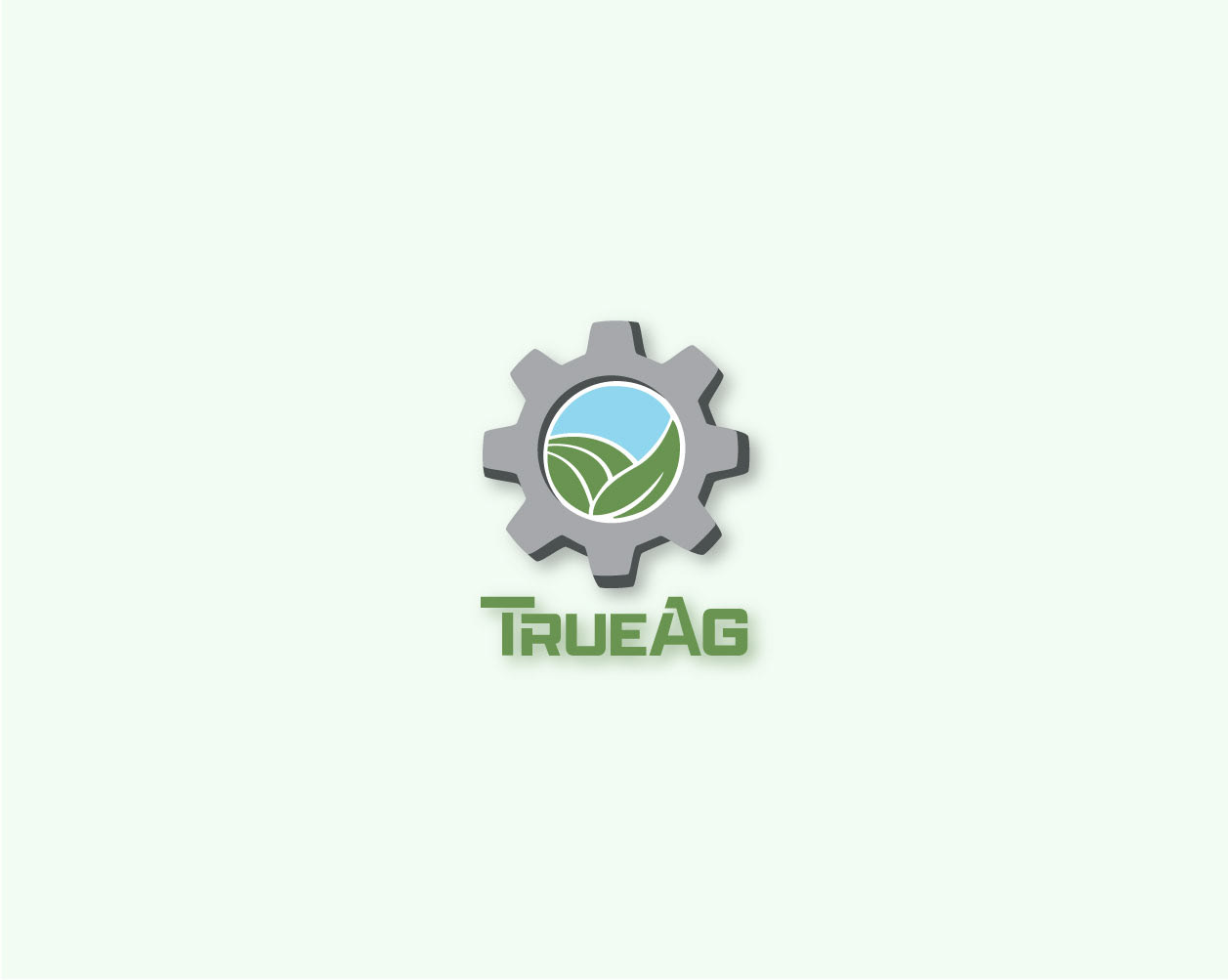
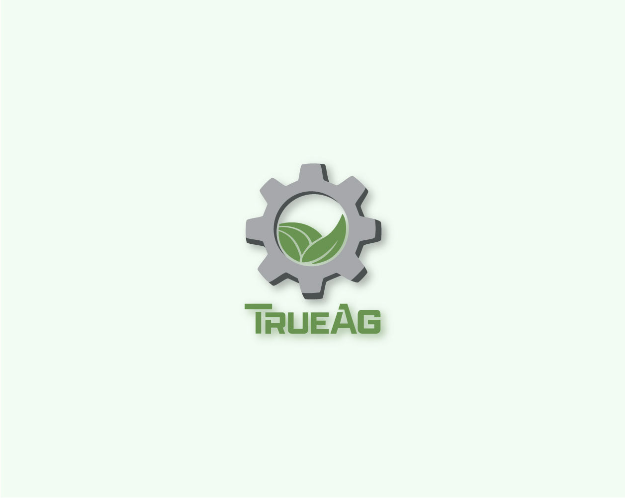
For True Ag Management Solutions, I was tasked with designing a logo that represented both sides of the client’s work—agricultural consulting and farm machinery. The mark combined a gear with crop-inspired visuals and used earthy colors to reflect soil, sky, and plant life. I chose a bold, masculine typeface for balance, then added negative lines through the “T,” “R,” and “A” to mimic rows of crops. The final logo conveyed both strength and growth, reflecting the client’s mission of helping farmers succeed through better crop and machinery management.
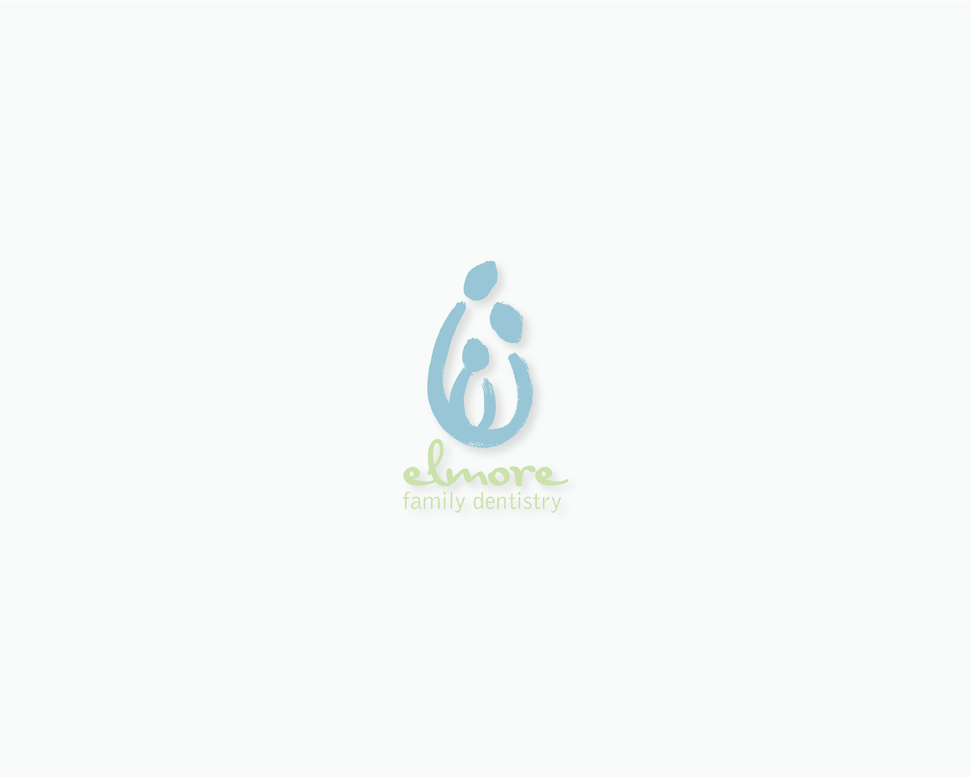
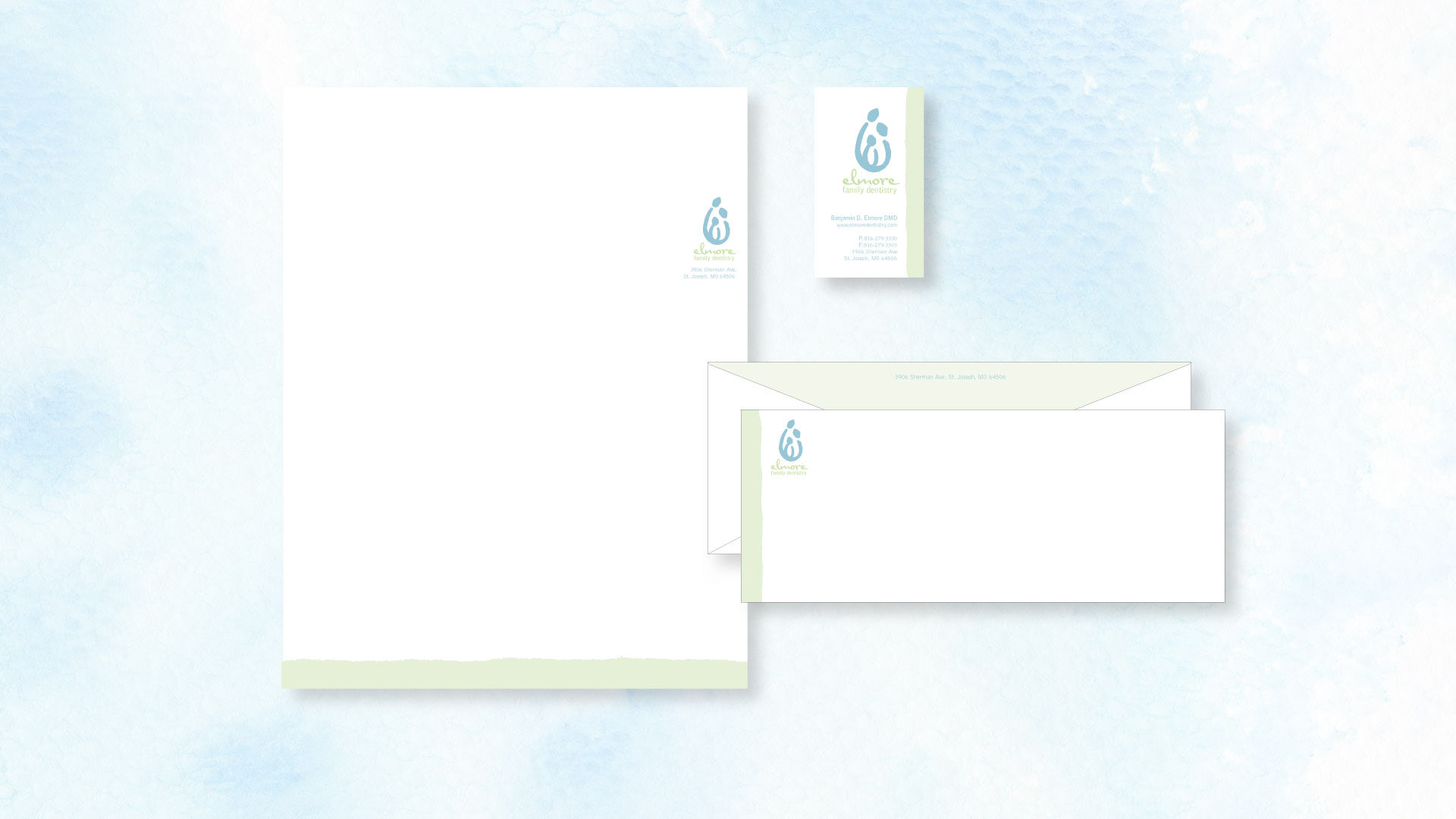
I partnered with a dentist to design a logo that reflected their values as a family-friendly practice. The client wanted the branding to feel fresh, clean, and inviting while emphasizing that they care for patients of all ages. To capture this, I created a stylized illustration of a couple surrounding their child, reinforcing the idea of family at the center of the practice. The hand-drawn style added a playful, approachable quality that connected with the younger side of their clientele. For typography, I chose a lowercase font to convey warmth and friendliness. Finally, I selected a palette of mint green and soft blue to emphasize cleanliness, freshness, and trust. The result was a welcoming identity that aligned with the practice’s mission of caring for the whole family.
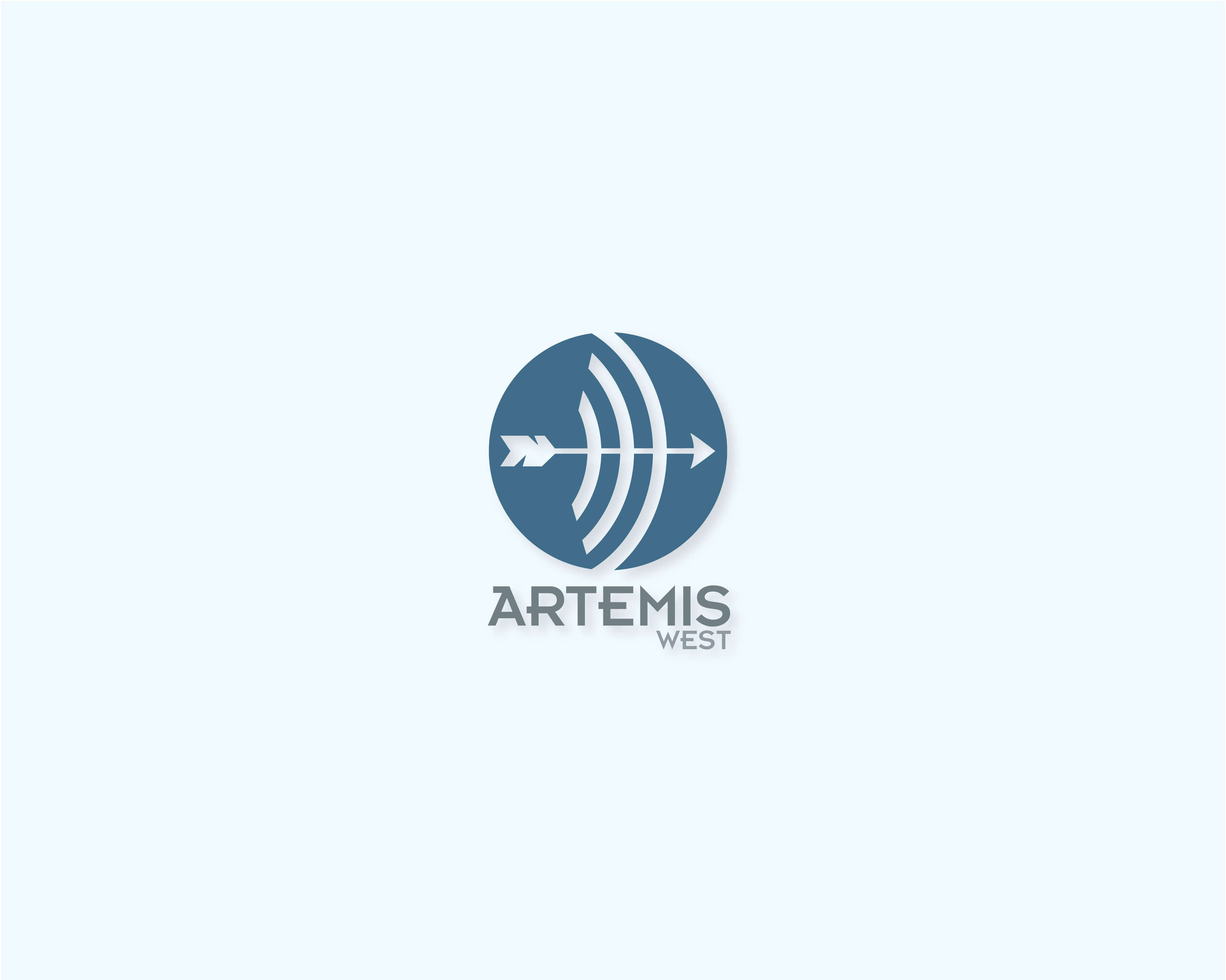
Logo created for airplane radar engineering company.
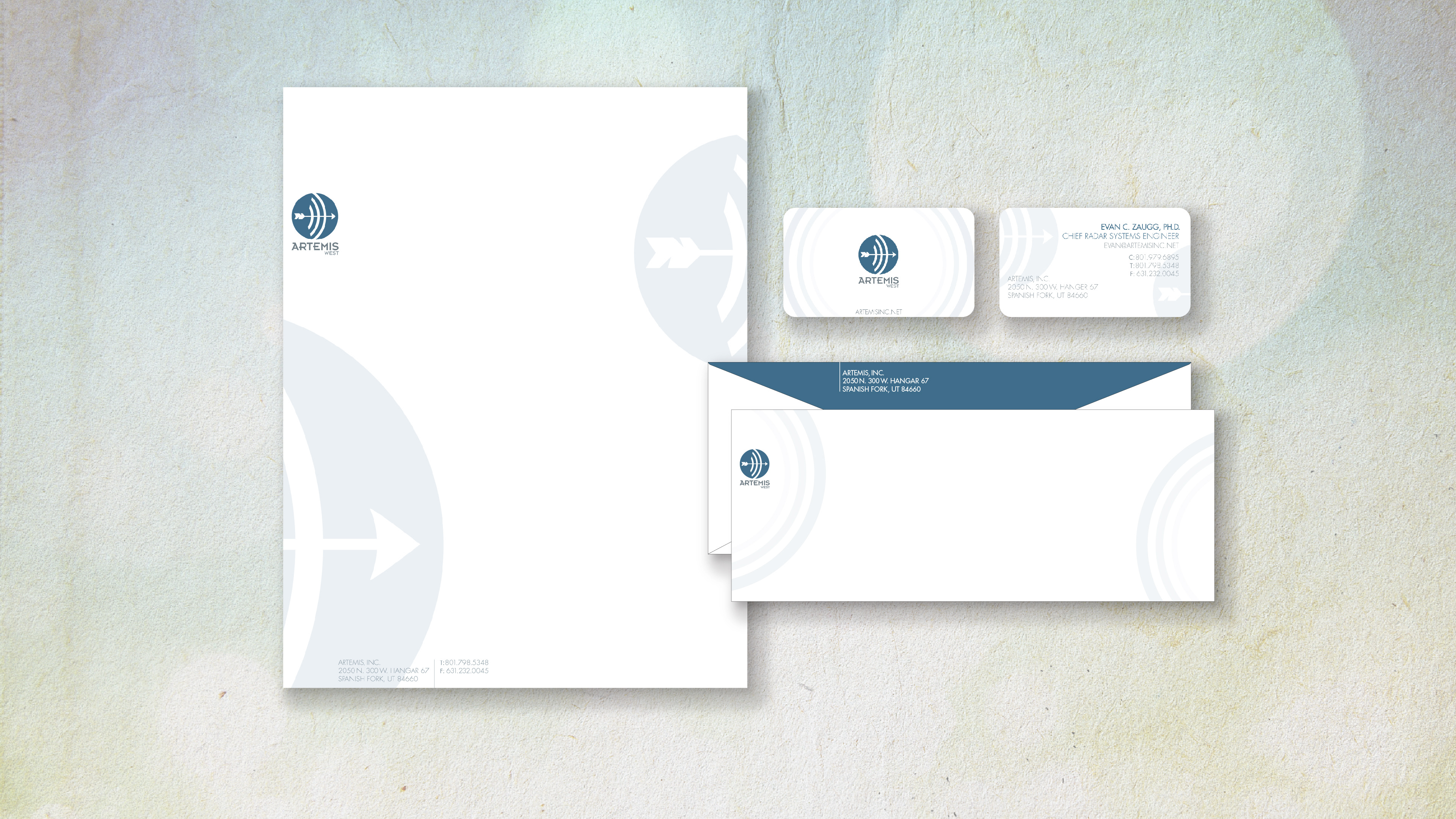
I designed the logo and stationery for Artemis West, an airplane radar engineering company. Inspired by the name Artemis, I incorporated themes of precision and the moon: the circle represents the moon, the arrow symbolizes accuracy, and the curved lines depict radar waves moving through the atmosphere. I chose a blue palette to reflect the sky and a modern, angular typeface inspired by Greek lettering. The final identity balances technical precision with mythological symbolism.