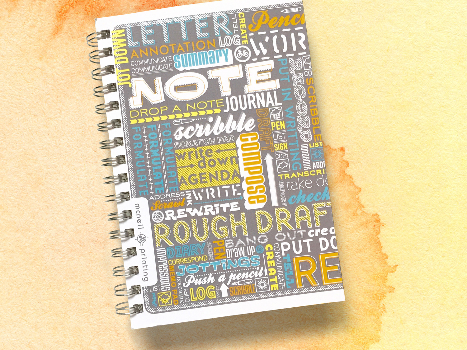
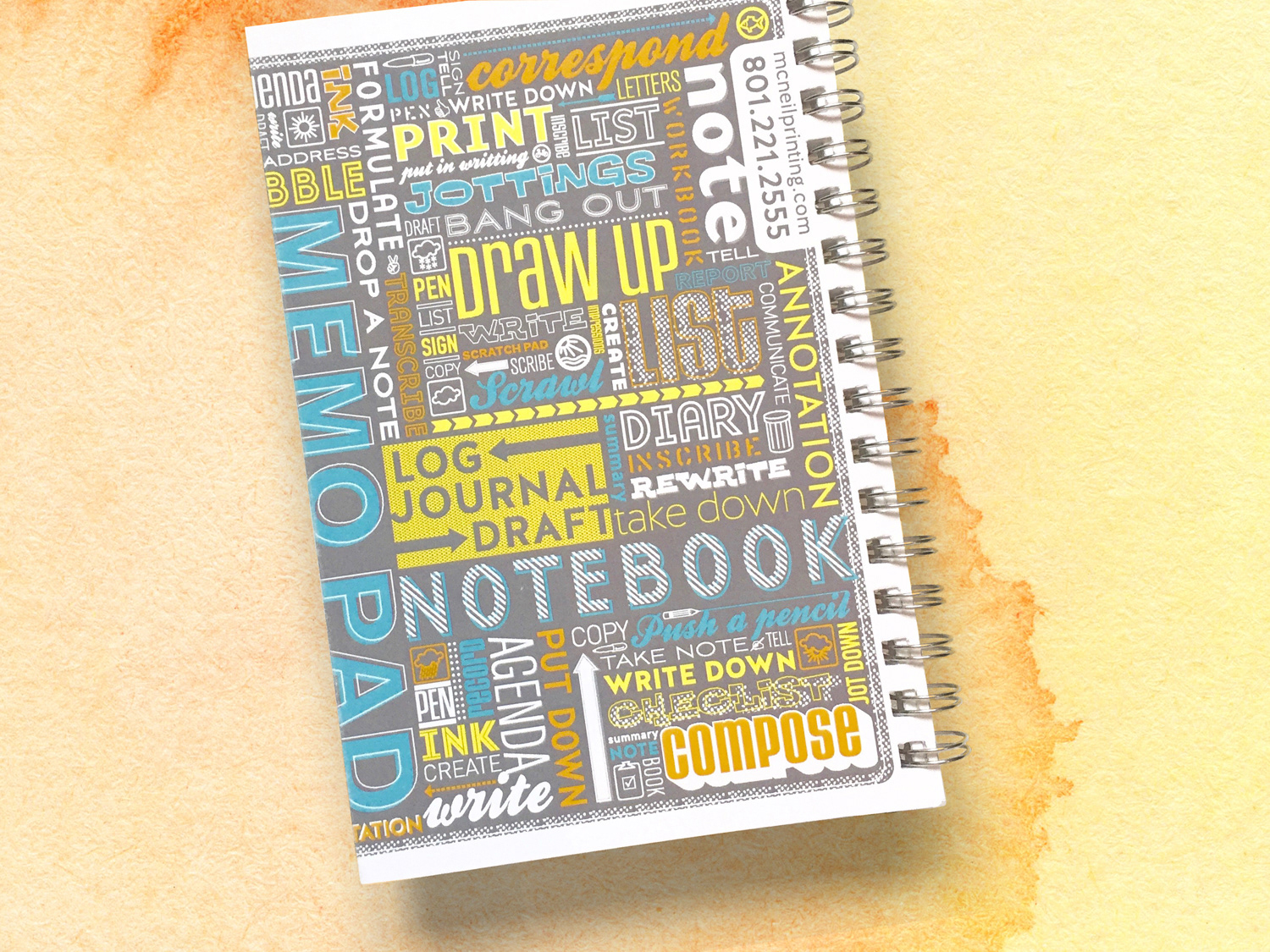
McNeil Printing hired me to design a notebook for their sales team to leave with potential clients after pitches. The goal was to create a visually striking, attention-grabbing piece. I approached the design with a typographic concept, using words related to writing and note-taking to create visual interest. The notebook featured a French fold on both the front and back covers and served as a creative way to showcase one of the company’s key printing services.
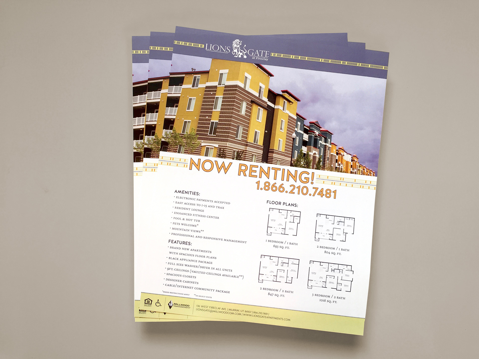
As a freelancer for Miller Development, I designed a flyer for Lions Gate Apartments aimed at highlighting amenities, features, and floor plans for potential tenants. I began by analyzing the photography and the key information to be communicated, then developed a layout using clean lines and square shapes to complement the architecture of the apartment complex. This approach created a structured, visually appealing design that guided the reader’s eye through the content.
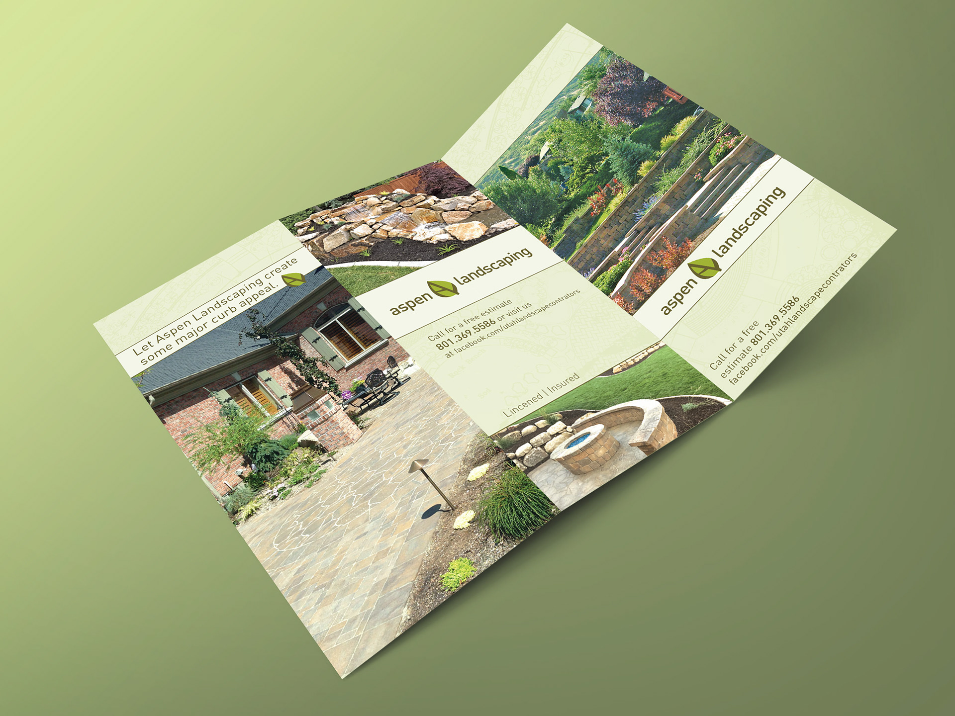
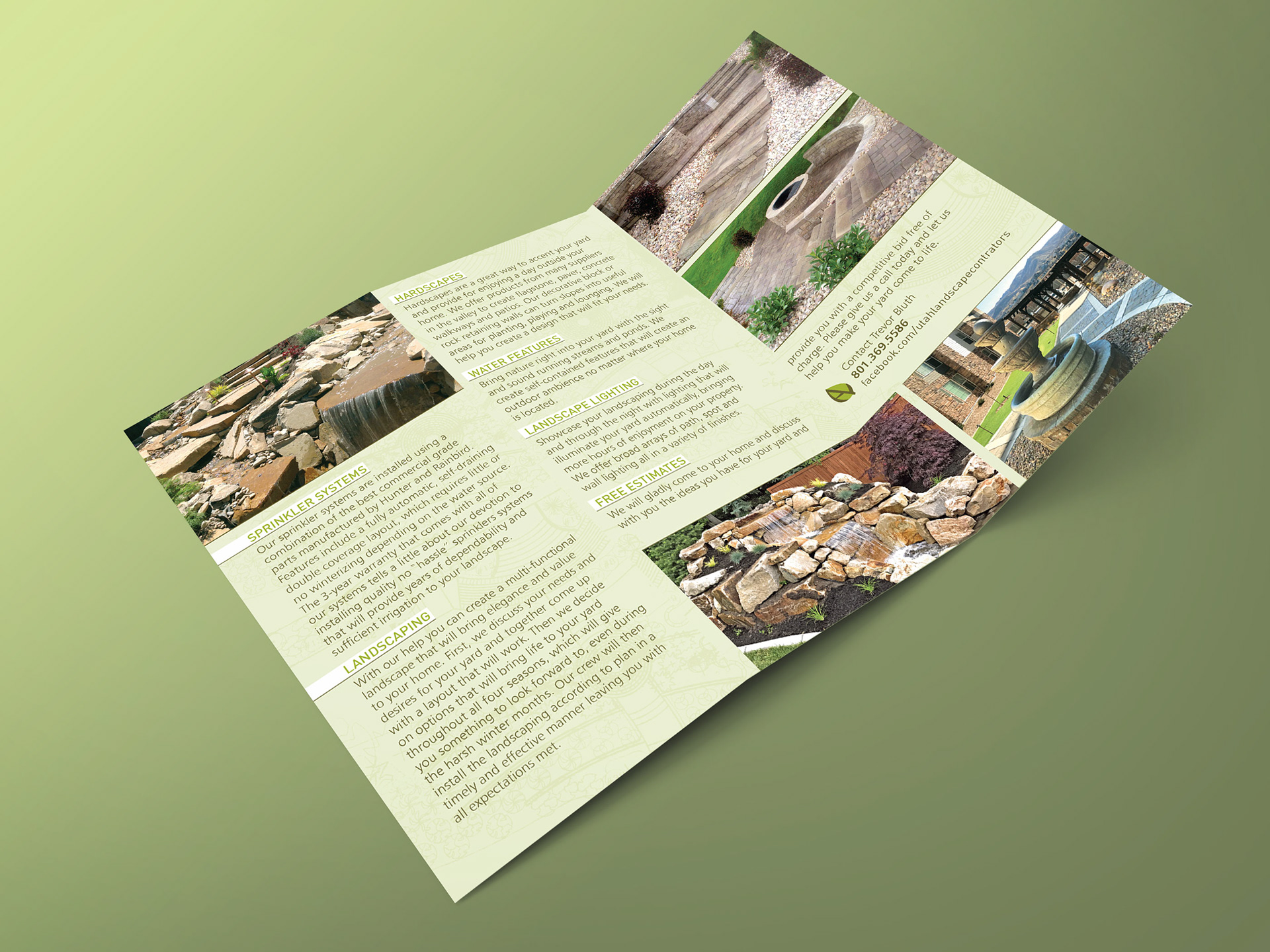
Aspen Landscaping, a local landscaping company, hired me to design a tri-fold brochure showcasing their services. The client provided photos of his work and requested a clean, simple design. I created a layout that was streamlined and easy to navigate while adding subtle texture by incorporating landscape architectural drafts as a design element.
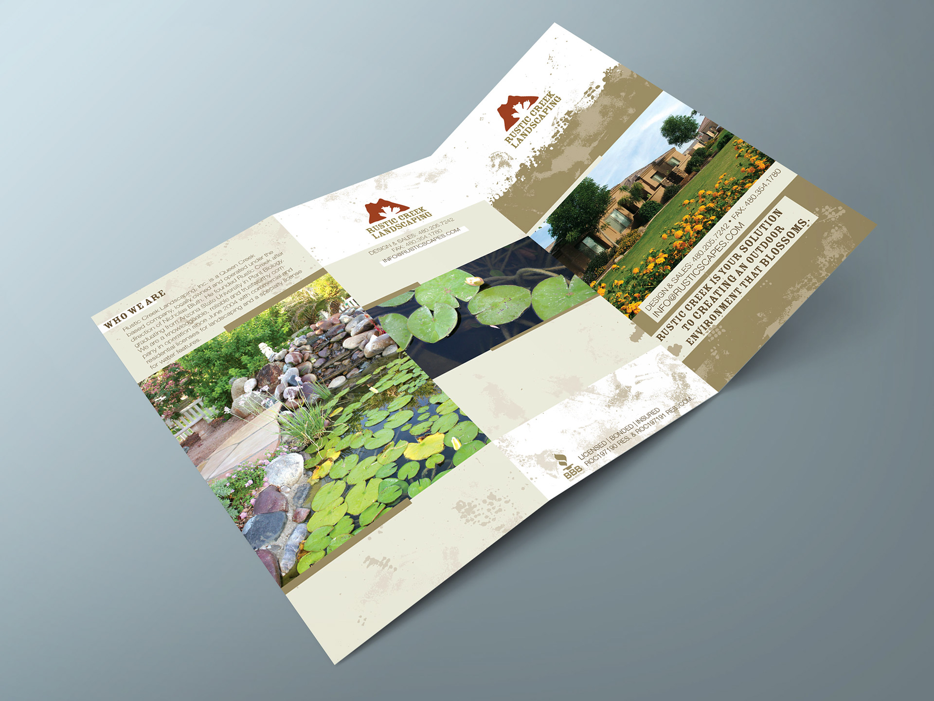
I designed a tri-fold brochure for Rustic Creek Landscaping by first considering how to visually convey the experience of working outdoors. I incorporated textured, “messy” design elements and a palette of earth tones to evoke that natural, hands-on feeling. I structured the layout around large photos to prominently showcase their landscape design work, ensuring the brochure felt both dynamic and approachable while clearly communicating their services.

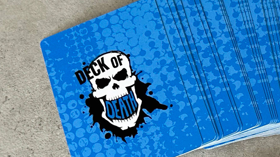
A Chicago-based charity organization hired me to design a flyer and ticket for their upcoming event, which featured a poker competition along with other card games. I started by exploring how to translate the concept of playing cards into a visual language that was both playful and sophisticated. Rather than using literal imagery, I created a conceptual design that highlighted the simple shapes and patterns found in cards, using bold colors and clean forms to craft a fun, engaging look while maintaining elegance and class.