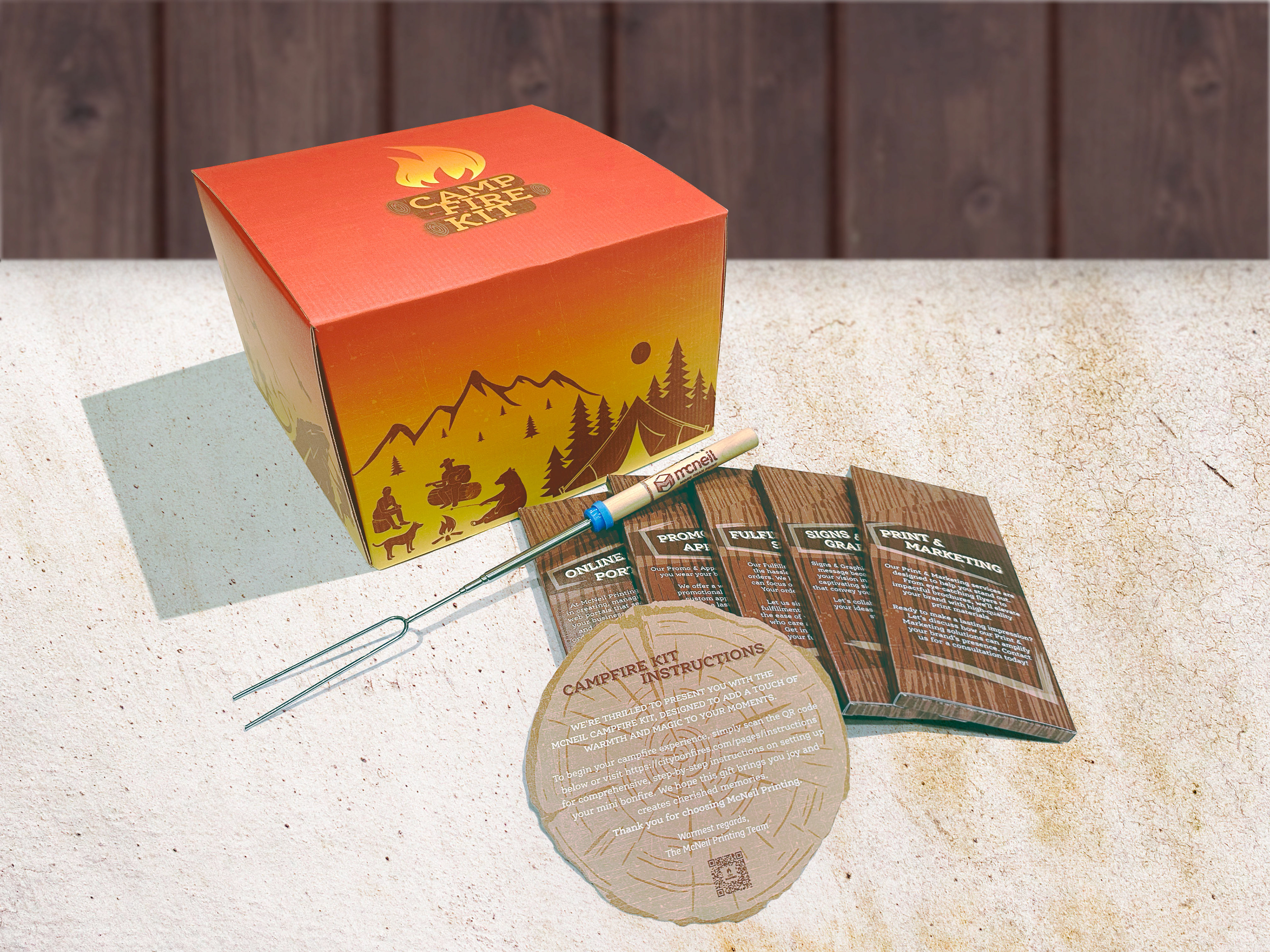
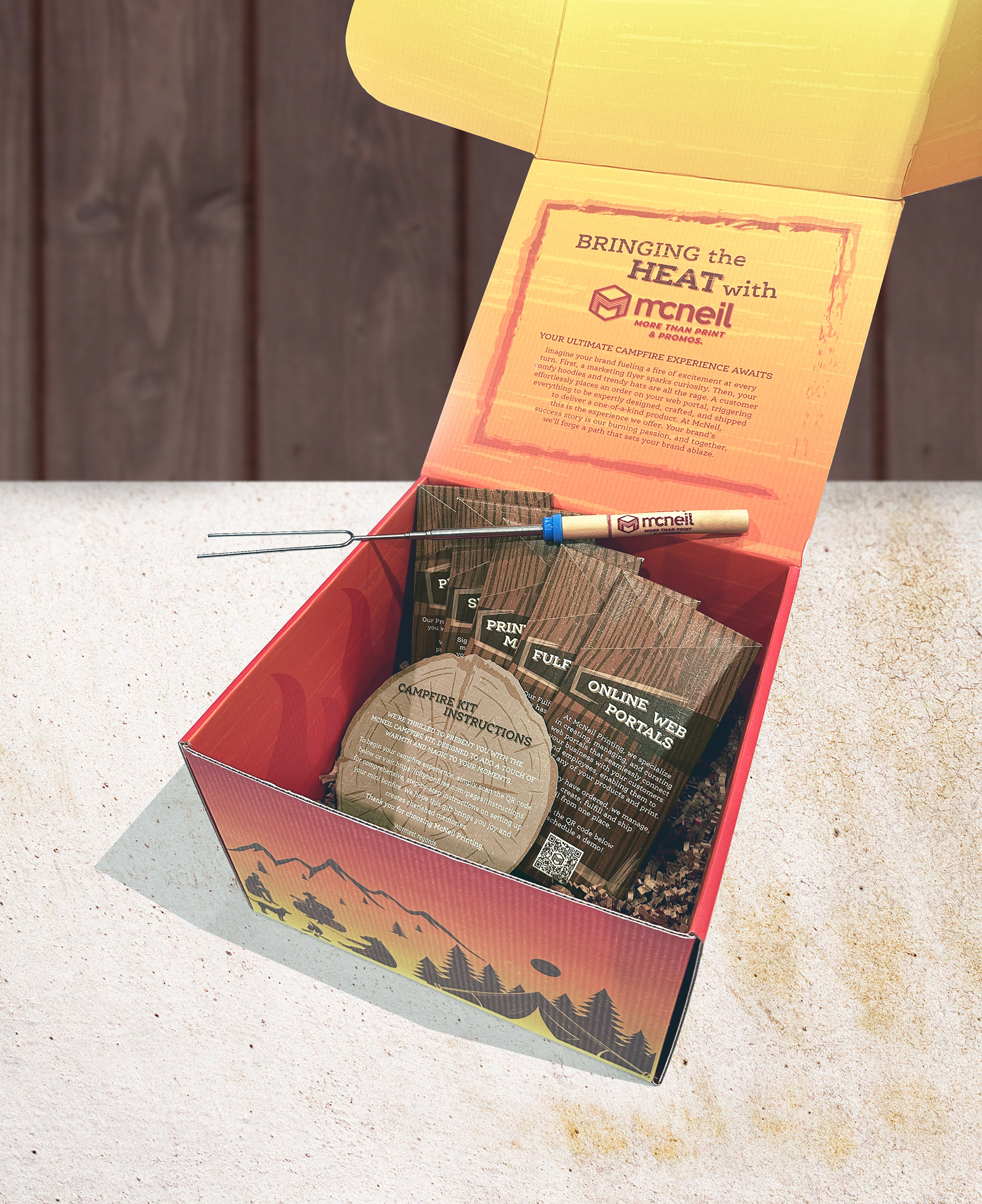
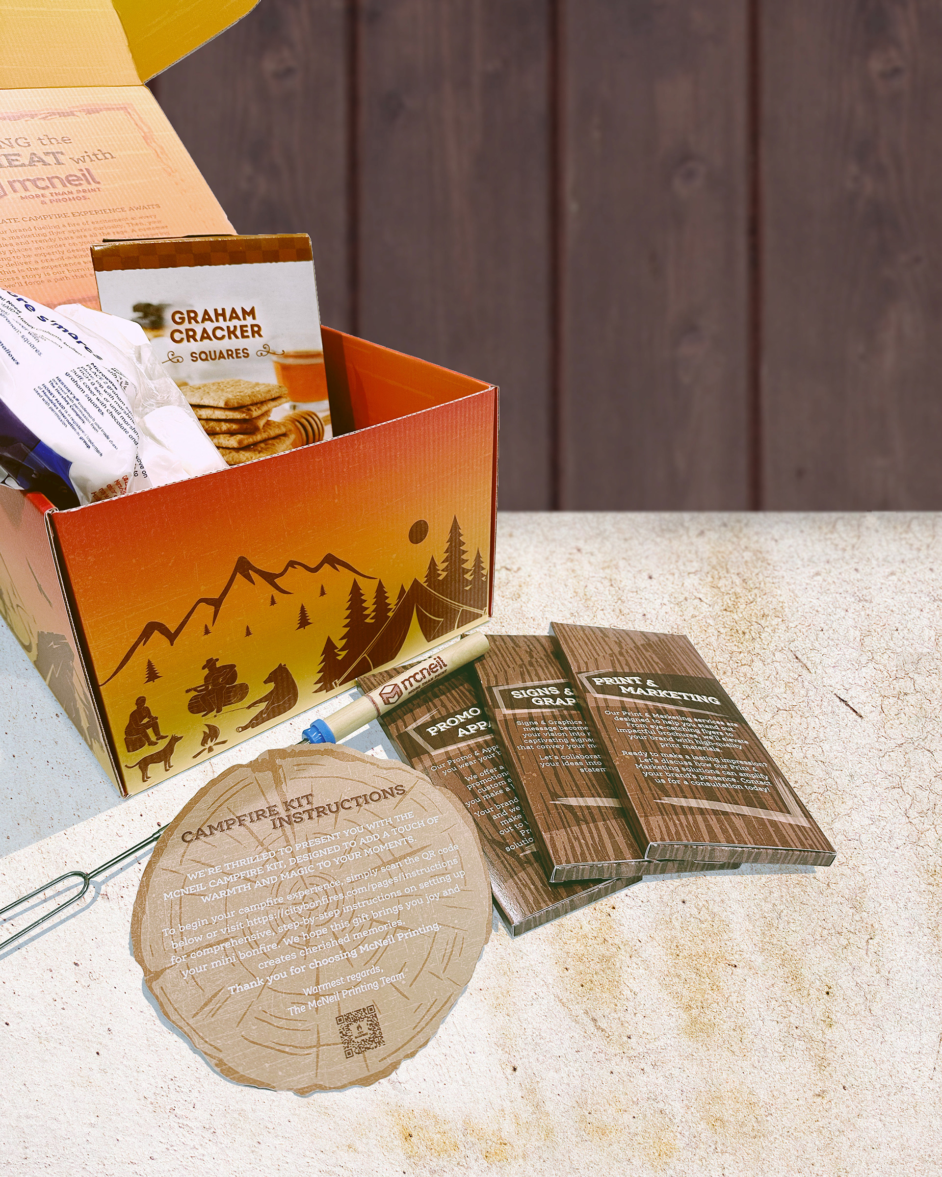
To help McNeil Printing launch their new promotions division, they asked me to design a custom s’mores kit mailer that showcased their creativity. They wanted the mailer to have a campfire inspired theme. I designed the box that held the kit with a warm colored gradient reminiscent of a fire decorated with a warm brown illustrations of the outdoors wrapping the base. Inside, we included marshmallows, graham crackers, and chocolate bars wrapped to look like logs—each highlighting one of their services—along with a branded marshmallow roasting stick and a round “log slice” card that introduced the team lead and explained how to use the kit. A message printed inside the box lid announced the new department. The final piece was a playful, memorable experience that captured the spirit of their brand.
A group of entrepreneurs hired me to design a set of three workout decks for men: upper body, lower body, and core/cardio. The goal was to create intense, no-excuses workouts for fitness enthusiasts who don’t have time for the gym. To match the brand’s gritty, hardcore vibe, I developed an edgy skull logo and packaging design that reflected the challenge of the workouts. Instead of using generic illustrations, I elevated the decks with professional photography and Photoshop enhancements, giving the product a bold and polished look.
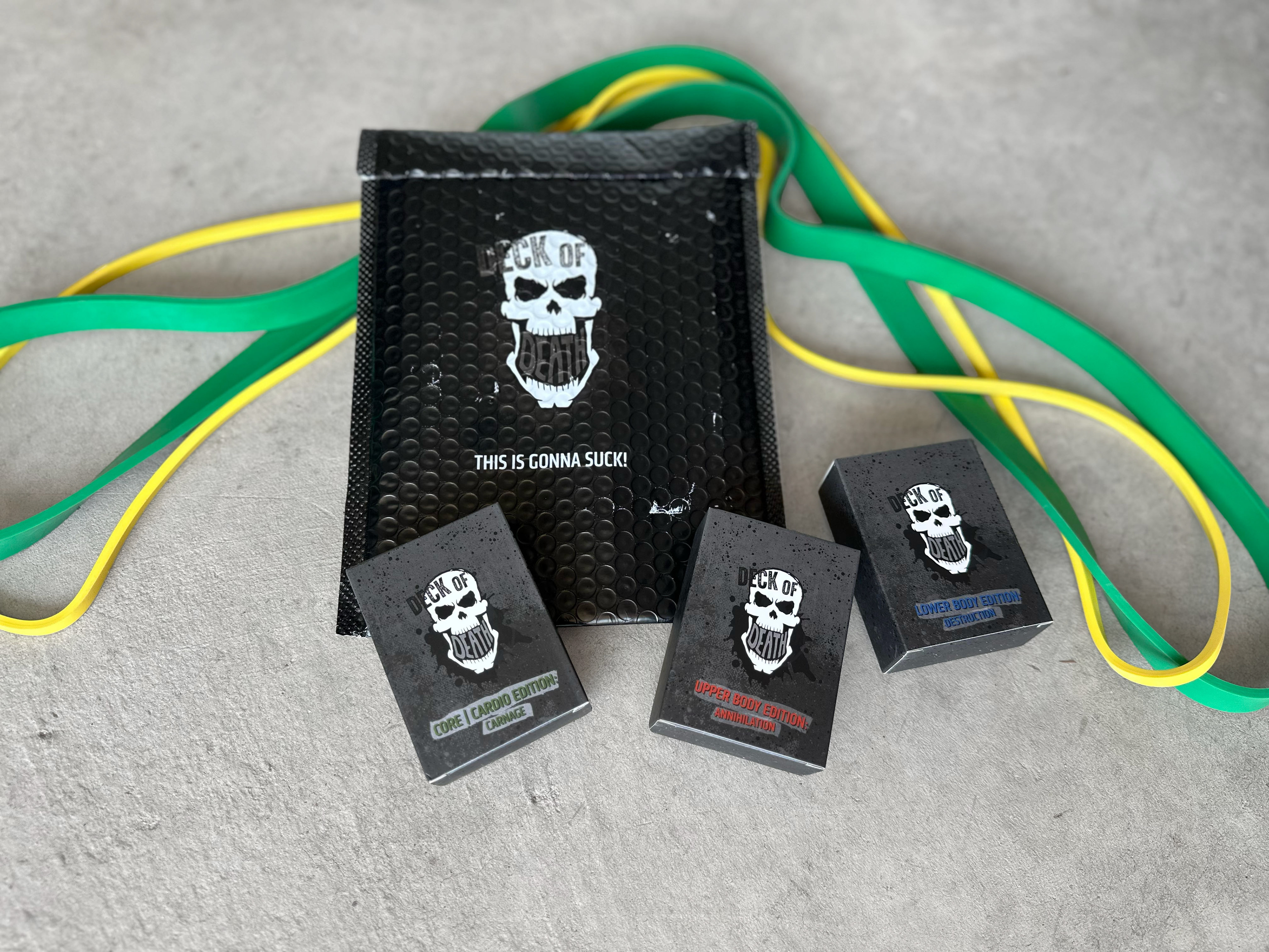
Bubble wrap package and card boxes.
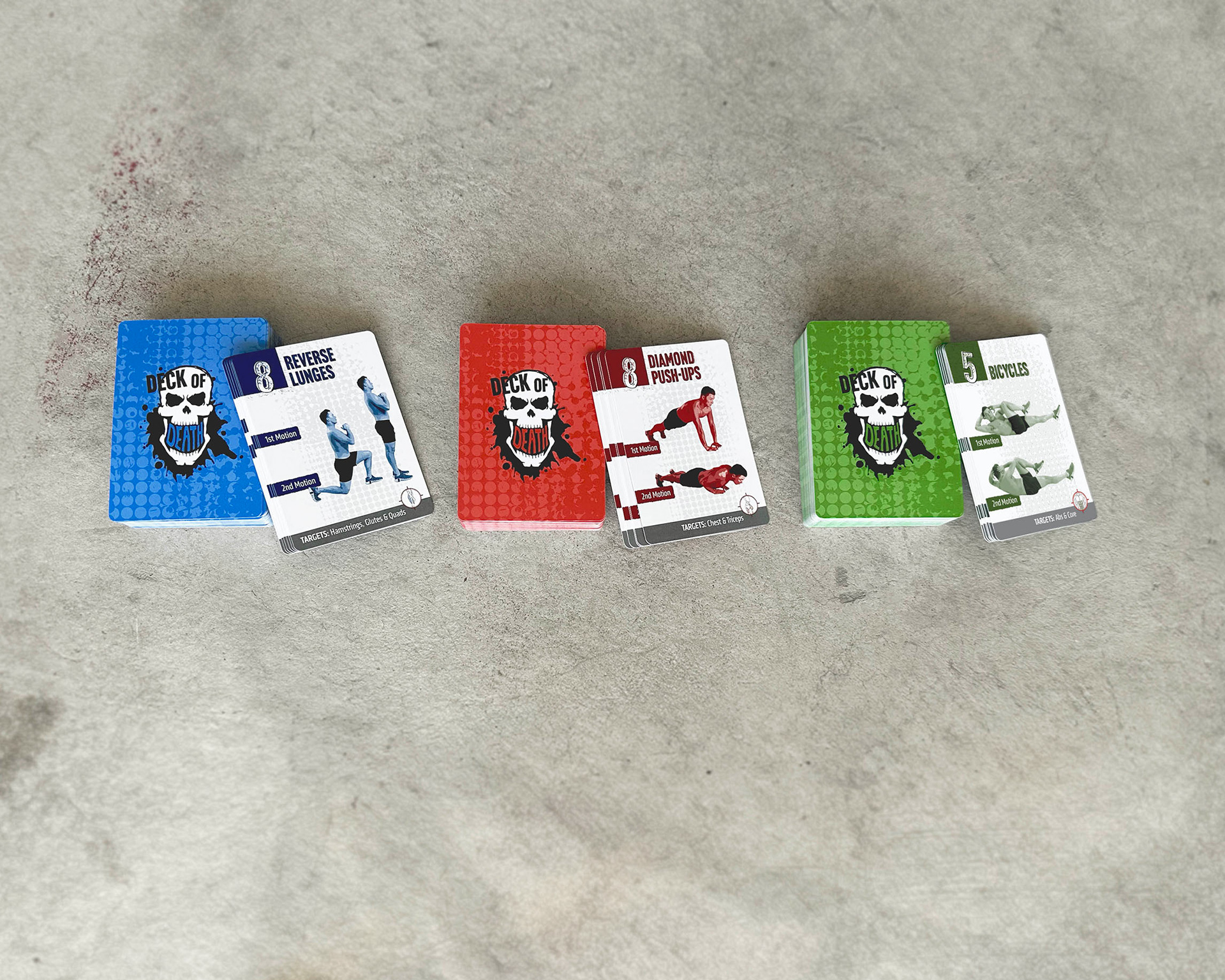
Blue: Upper Body Deck Red: Lower Body Deck Green: Core/Cardio Deck
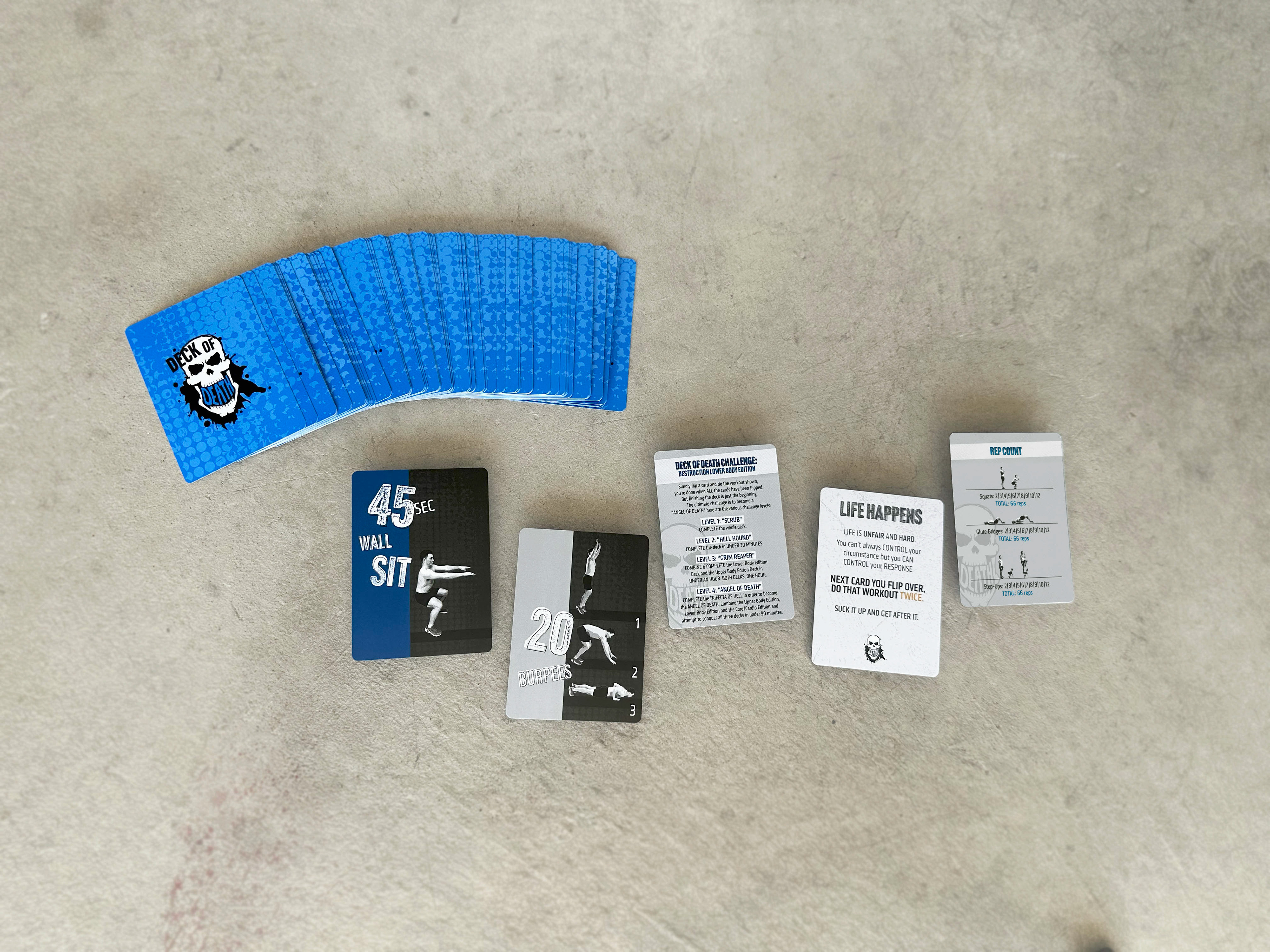
Each deck has a Rep Count card, Level of Difficulty Card and Challenge cards.
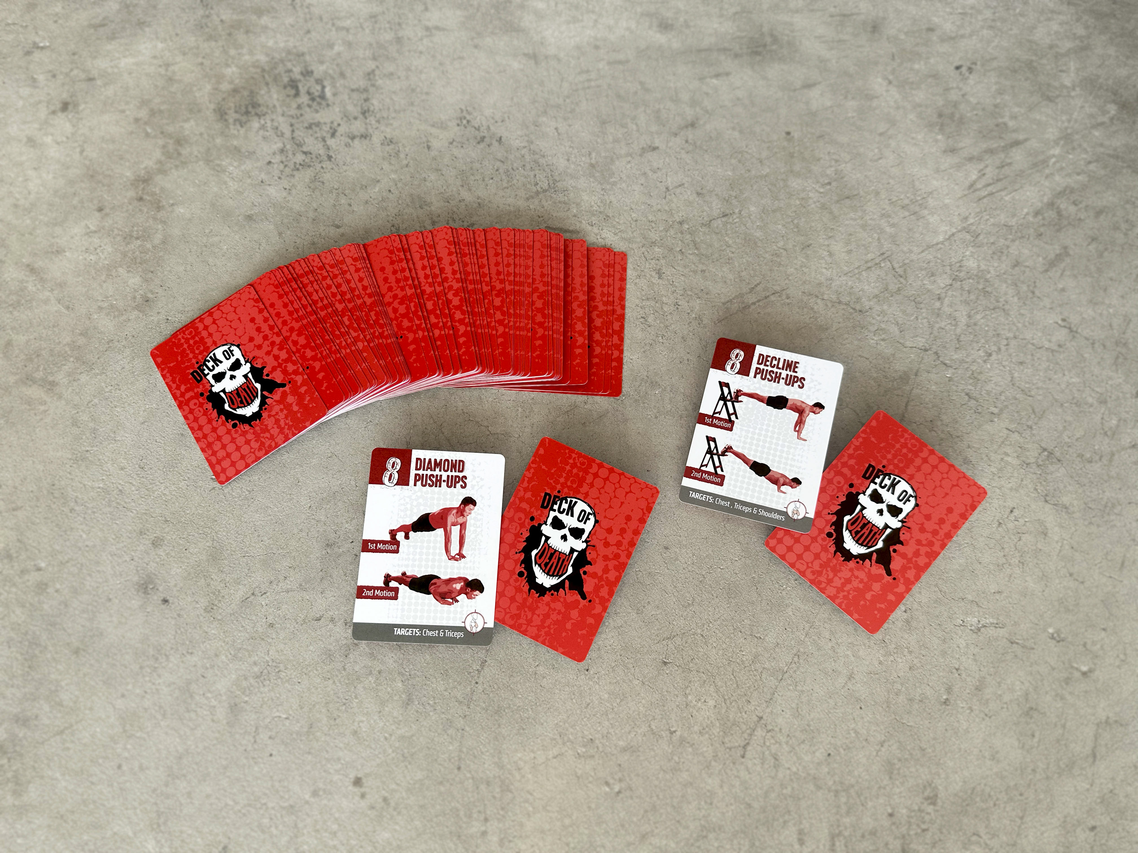
Red upper body deck has six movements.
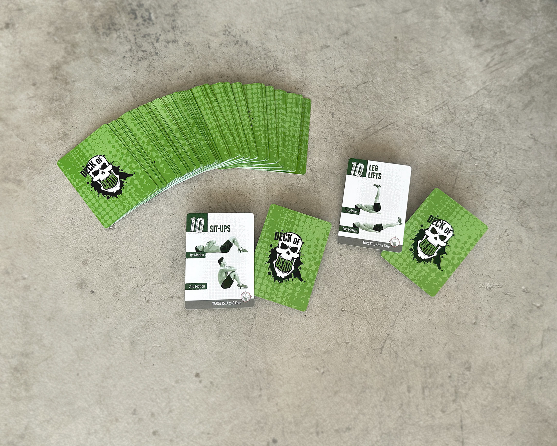
Green Core/Cardio deck has eleven movements.
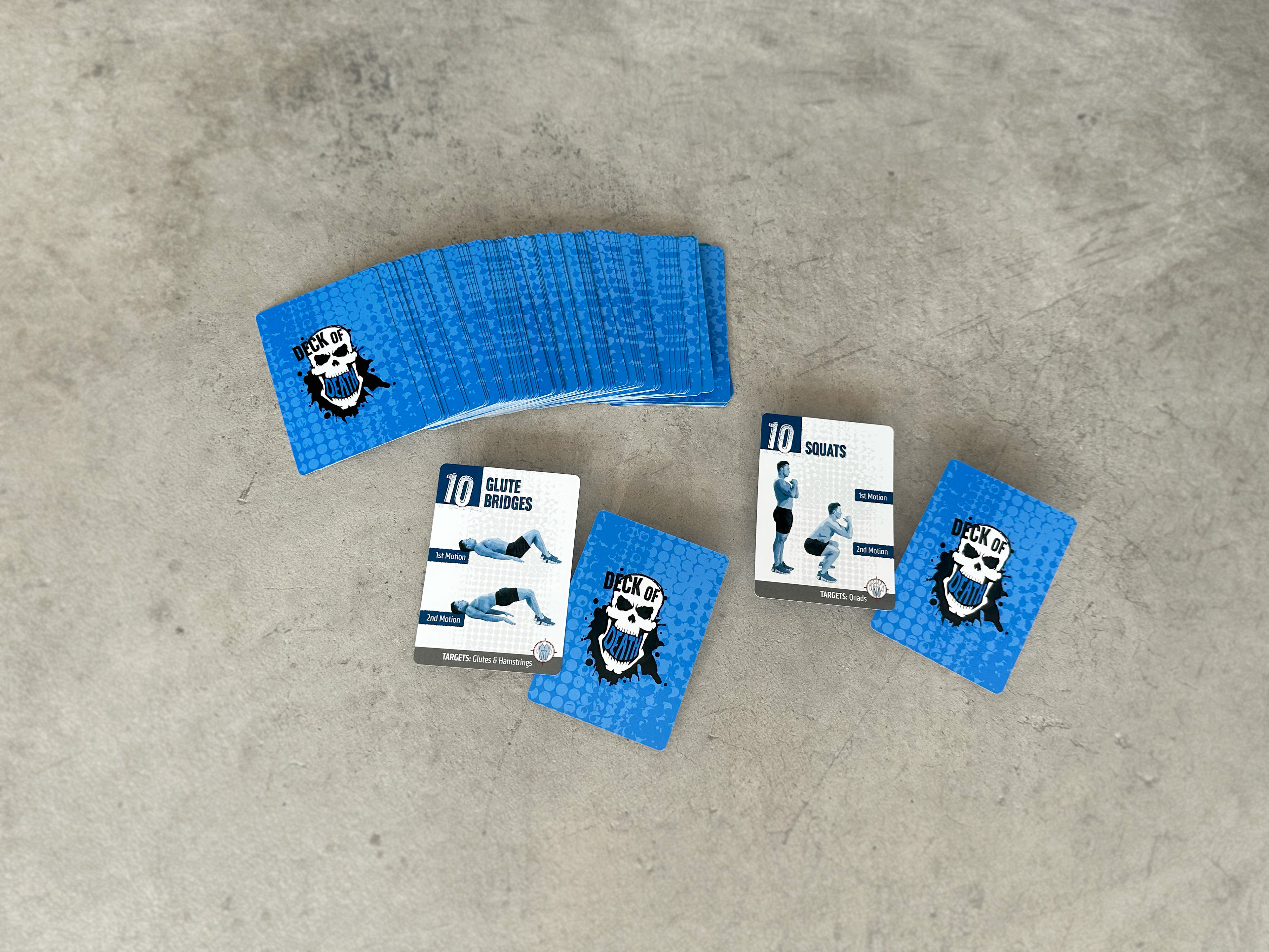
Blue lower body deck has six movements.
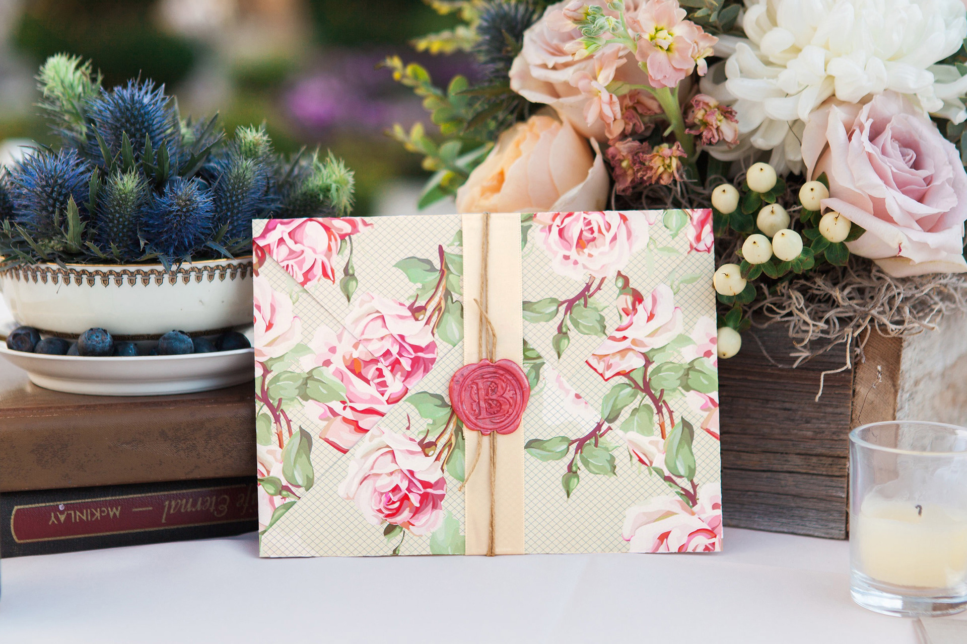
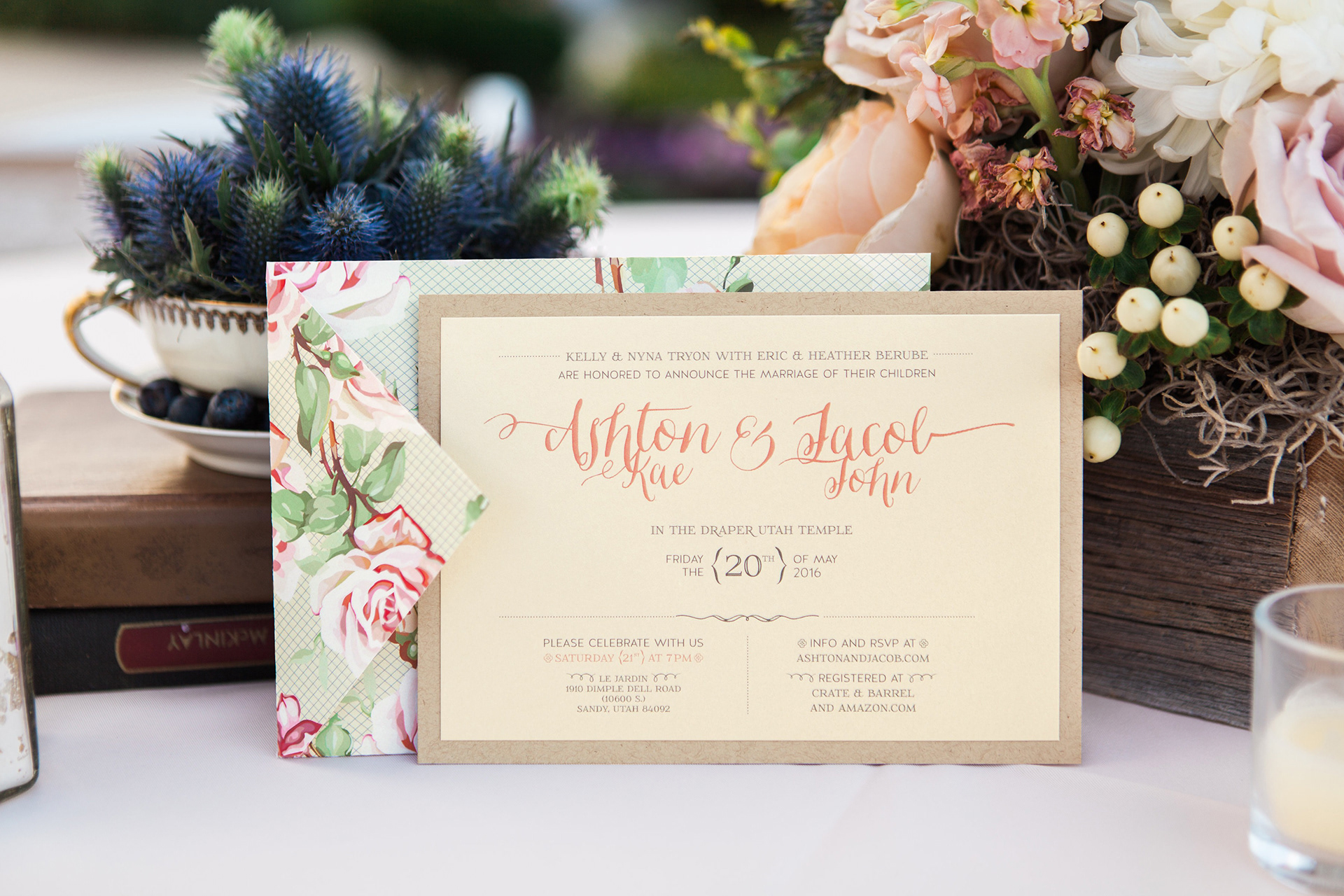
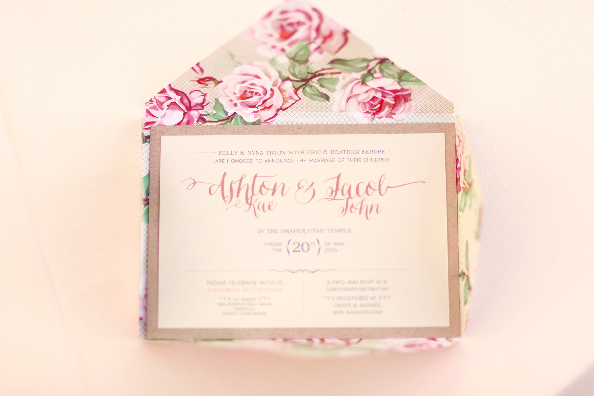
A local couple hired me to design their wedding invitation, knowing that it would set the tone for their vintage elegance–themed wedding. I began by exploring ways to create a sense of depth and sophistication through layered paper design. The solution was an inner envelope with a floral pattern, enclosed with a paper band, twine, and wax seal to add texture and elegance. I carefully selected typography that balanced beauty with clarity, ensuring that the information was organized in a straightforward, readable way while complementing the overall design.