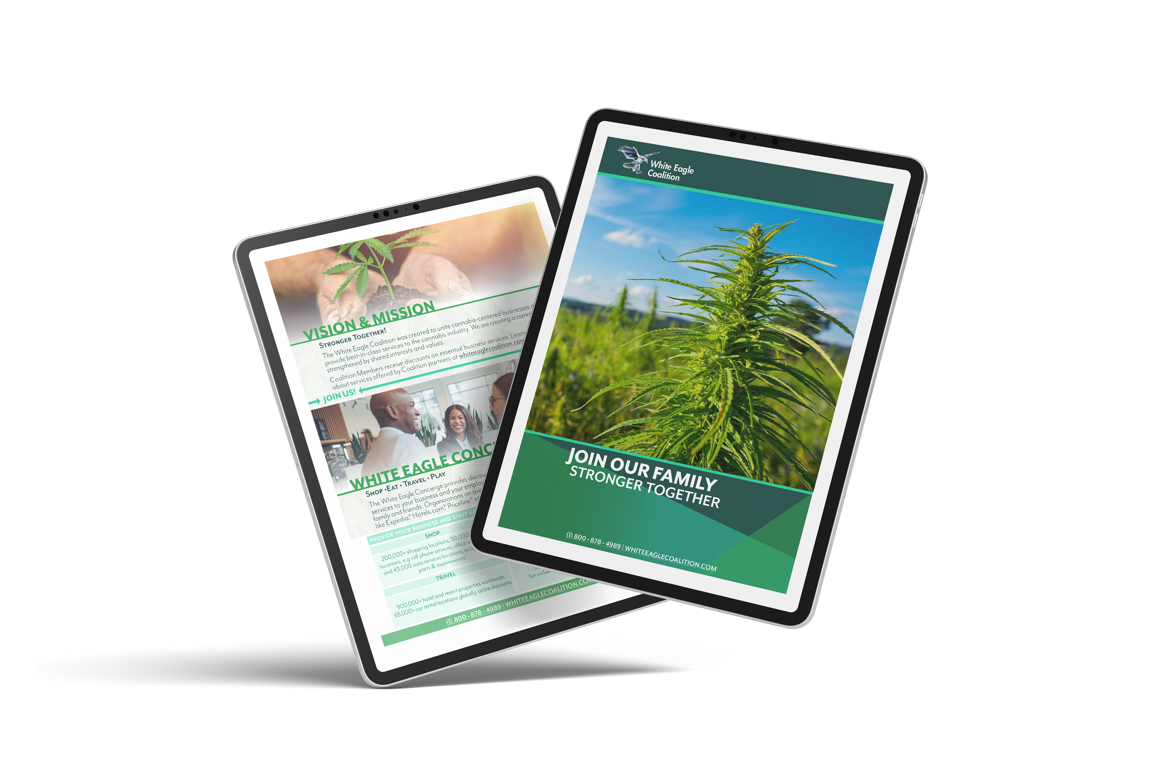
White Eagle Coalition hired me to design a four page digital brochure aimed at their farmer clientele. The client provided an existing logo and established color palette, and my goal was to create materials that felt current, visually engaging, and well-organized. I focused on layouts that prioritized clarity and readability while maintaining a clean, visually appealing design that showcased the brand.
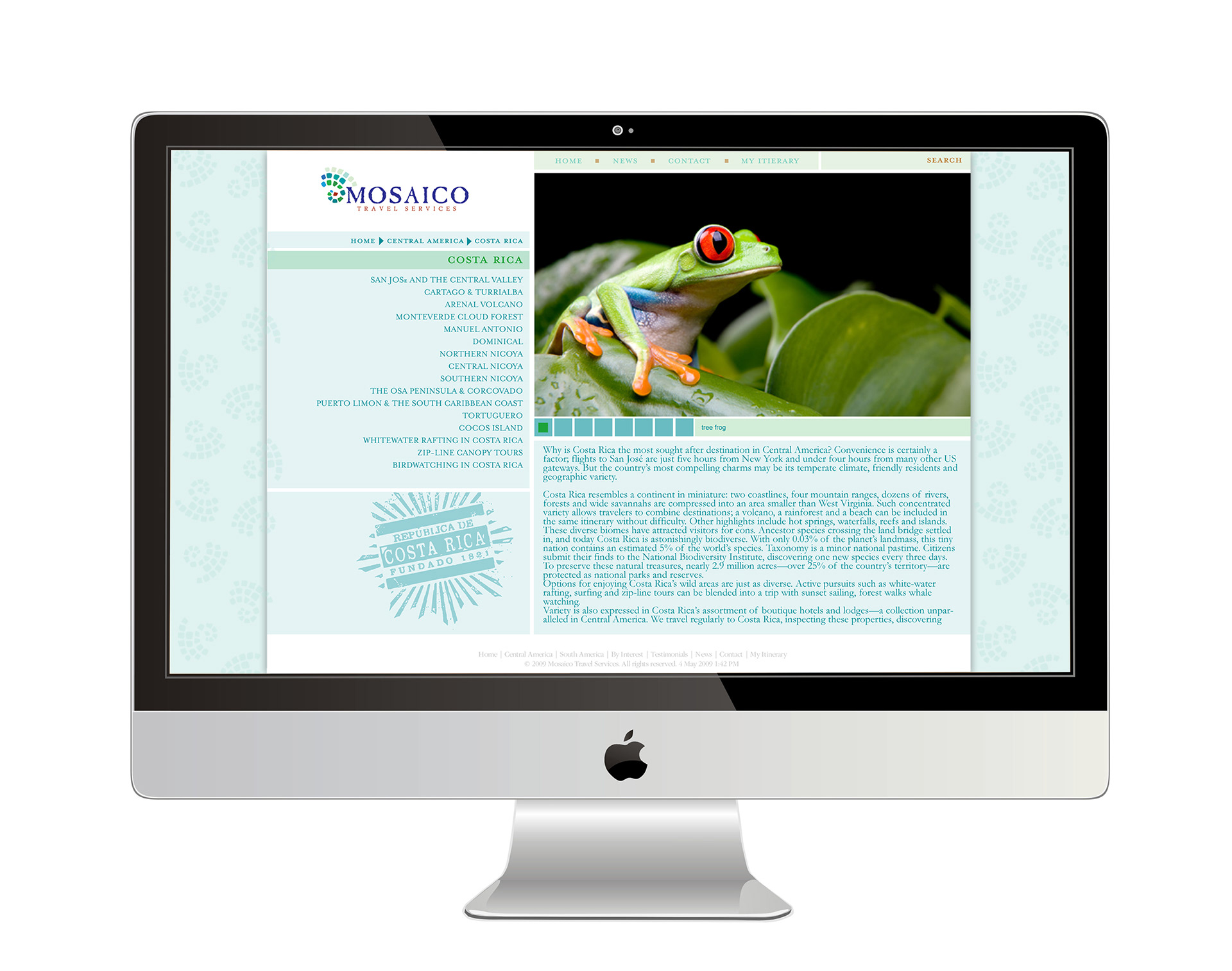
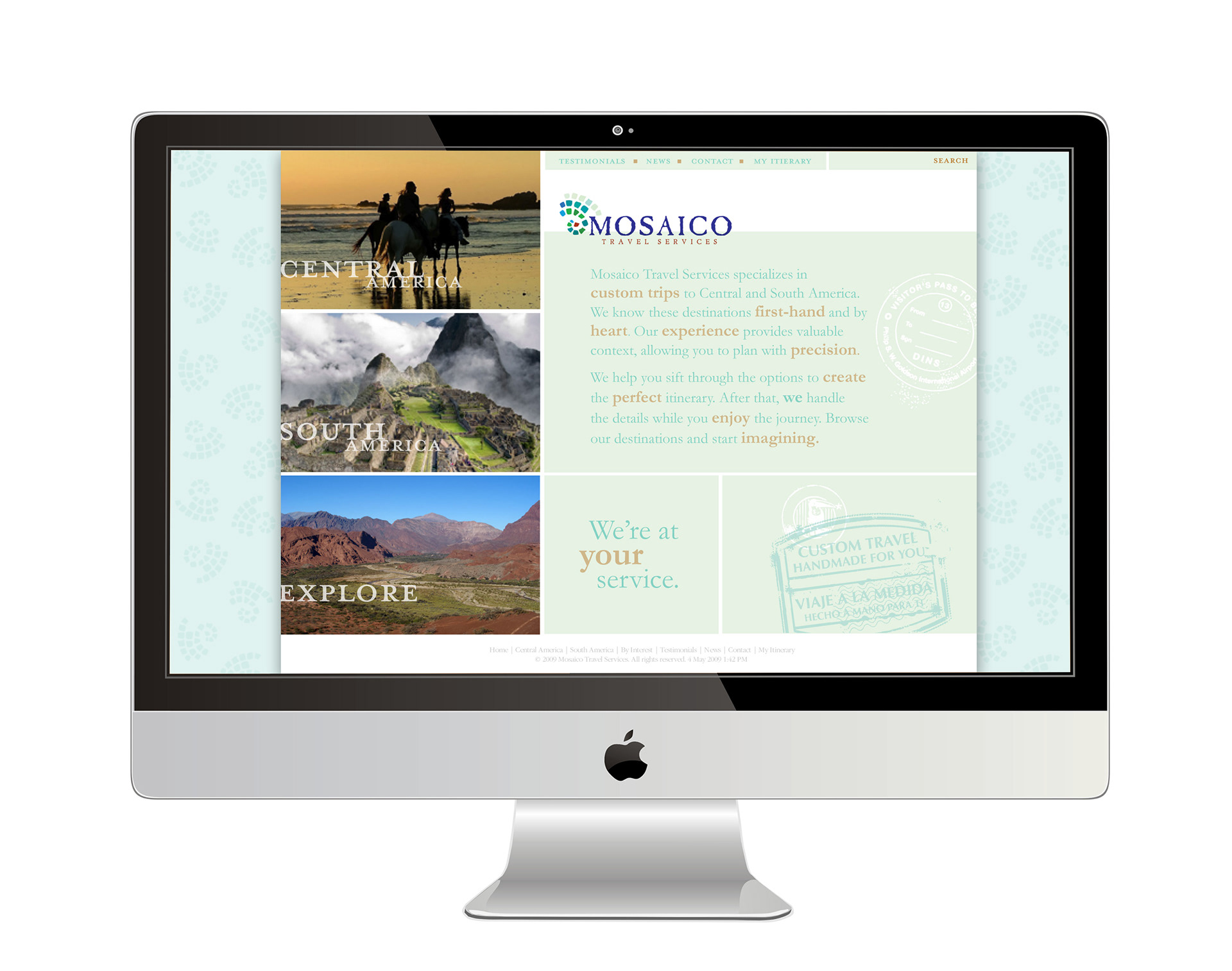
A local travel company hired me to redesign their website while maintaining their established logo and brand colors. After reviewing their existing content and logo, I chose a clean grid layout to reflect the tile motif in the logo, while also providing a clear hierarchy for organizing text and images. To reinforce the travel theme, I incorporated a graphic stamp element, evoking the look of passport stamps and enhancing the site’s visual storytelling. The result was a cohesive, user-friendly website that aligned with the company’s brand identity and communicated their services effectively.
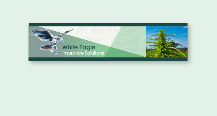
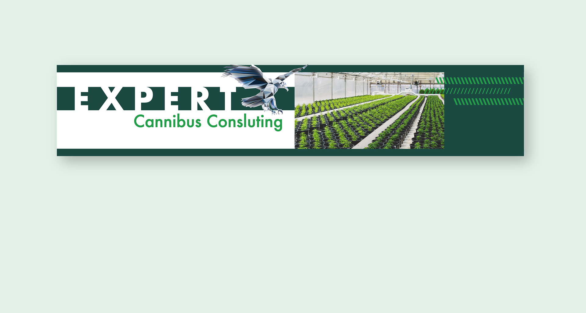
I designed a series of digital banner ads for multiple divisions of White Eagle, ensuring a cohesive visual identity across the brand. While maintaining consistency, I tailored the designs to meet the needs of each division—creating a clean, simple look for the Coalition side of the company to reflect its professional and approachable nature. The result was a unified set of banners that effectively communicated the brand while accommodating the distinct personalities of each division.
I designed a series of blog buttons for the Brigham Young University Women’s Conference. The client requested a typographic approach that conveyed a feminine and approachable aesthetic. I focused on selecting fonts, layout, and styling that emphasized elegance and readability, resulting in buttons that aligned with the conference’s brand while appealing to its audience.

I created a series of memes for the Brigham Young University Women’s Conference. The client wanted designs that were simple, engaging, and maintained a feminine aesthetic. I focused on clean layouts and typography that conveyed the intended tone, resulting in shareable content that aligned with the conference’s brand and resonated with its audience.